J1 Theme ships with a Master Header Module for all content pages. A Master Header, a so-called Attic, always gets placed at the very top position of a page. All Master Header types provide a simple yet powerful text overlay technique to automatically present animated text taken from your content pages, or the header configuration in a page, for a title and a tagline.
The jQuery plugin Backstretch is the default library for image- and video-based headers. The full documentation, plus several examples, can be found at Backstretch Home Page. The Git repository is available at Github.
Header Types
Attics are available as simple, text-based headers as well as headers displaying images and videos supporting all common image and video formats. Besides static images, video clips (online videos and HTML5 videos) are supported for a more eye-catching experience.
Text-based Header
A simple, text-based master header is quite useful for common content pages. This header type supports a colored background and animated text overlays for both the title and the tagline of a page.
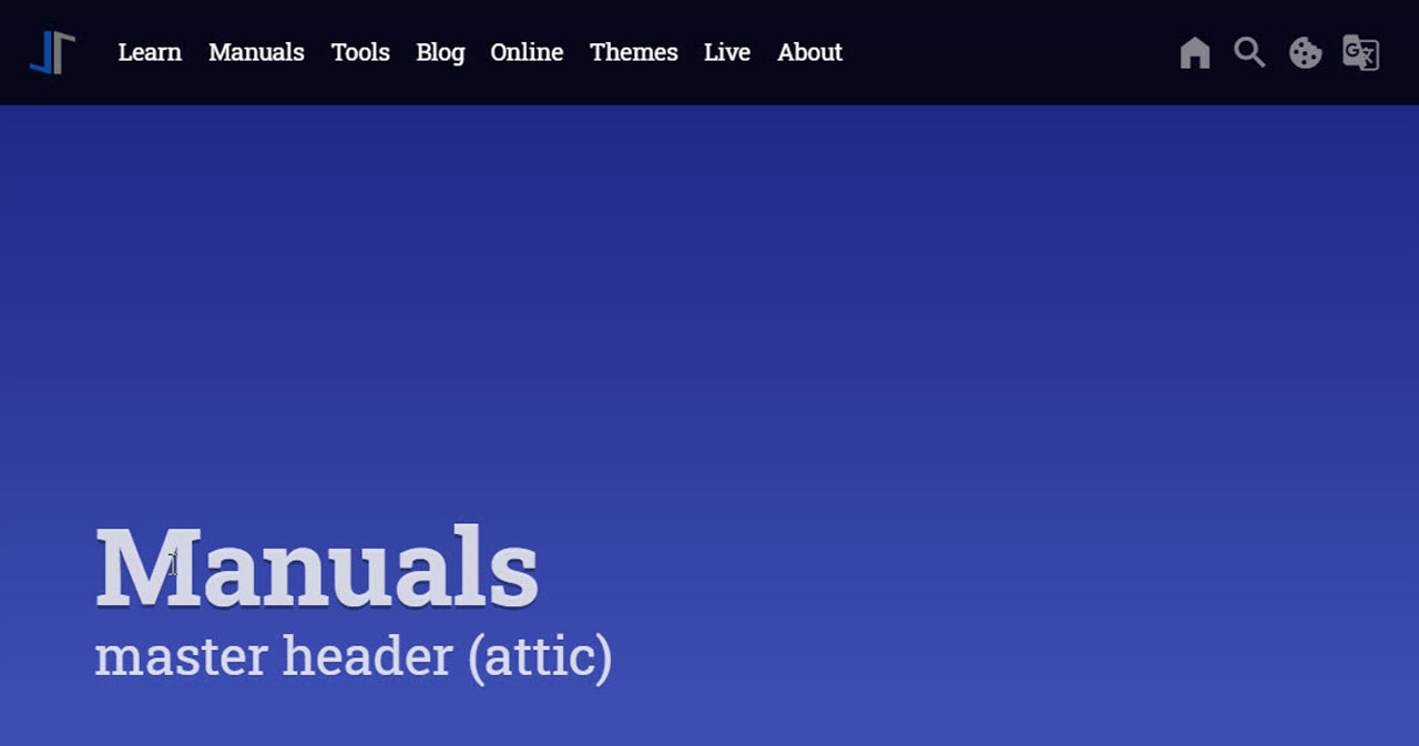
Image-based Header
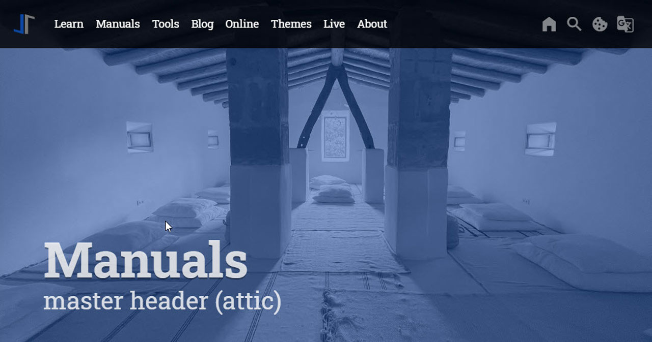
An image-based master header is characterized by dynamically-resizable, slideshow-capable background images or videos. The image (or video) stretches the width full-size and will get resized automatically if the page size changes. Image-based attics are fully responsive and display excellent quality on devices like desktop computers, tablets, or mobiles.
Header Configuration
The header module of J1 Theme allows multiple headers for your Web. Generally, a header is related to a layout and can also be individualized on a per page basis.
The module supports setting up as many different headers as layouts exist. Thus, the header on the home page (layout home) may be different from the header used for pages (layout page), posts (layout post), or collections (layout collection).
While you can provide a common header for all content pages that belong to a certain layout, you can further individualize a header configuration on a per page basis for pages that should have a unique header.
Configuration parameters are being processed in the following order:
-
Default values
-
Layout-specific values
-
Page-specific values
General Configuration
In a J1 Theme page, the header module gets configured by the YAML data file _data/modules/attics.yml. The data file consists of three sections:
-
Default header settings (text- and image-based headers)
-
Default image settings (image-based headers only)
-
Layout specific header settings (text- and image-based headers)
attics.yml# ------------------------------------------------------------------------------
# Default configuration settings
#
defaults:
# ----------------------------------------------------------------------------
# Global settings for (all) text- and image-based attics
#
debug: false
circuit: false
notranslate: true
pauseOnHover: false
icon_family: MDI
icon_color: "#9E9E9E"
icon_size: default
raised_level: 0
r_text: enabled
text_emphasis: stronger
padding_top: 200
padding_bottom: 50
margin_bottom: 50
title_size: 3em
title_color: rgba(255, 255, 255, 0.8)
title_animate: animate__bounceInDown
title_align: left
tagline_size: 1.5em
tagline_color: rgba(255, 255, 255, 0.8)
tagline_animate: animate__fadeInRight
tagline_align: left
# Gradient effect (background color)
#
background_color_1: "#1A237E"
background_color_2: "#3F51B5"
action_enabled: false
action_url: "#void"
action_button: btn-default
action_icon: download
action_icon_family: MDI
action_text: Download Now
logo_enabled: false
logo_url: /assets/image/modules/icons/j1/j1-512x512.jpg
logo_alt: Jekyll-One-Template
logo_height: 196
logo_animate: animate__slideInDownLayout-specific Configuration
The configuration of the layout-specific header is quite simple and can be found in the second section of the header config file. The headers configuration array organizes layout-specific header settings. This array consists of key-value pairs (hashes), one per layout. Each header gets configured by a unique header id dedicated for a layout.
| Layout-specific headers use the same key-value pairs as specified by the default section. Technically, a layout-specific header configuration overloads all the parameters (by key) already specified by their defaults. |
# ------------------------------------------------------------------------------
# SETTINGS
#
settings:
  # ----------------------------------------------------------------------------
  # Layout specific properties
  #
  attics:
    # --------------------------------------------------------------------------
    # Home page (index.html)
    #
    - name:                             Home
      attic:
        enabled:                        true
        id:                             attic_home
        layout:                         home
        background_color_1:             '#0D47A1'
        background_color_2:             '#0D47A1'
        padding_top:                    400
        padding_bottom:                 50
        opacity:                        0.5
        filters:
          grayscale:                    0
          contrast:                     0.8
          brightness:                   0.8
    # --------------------------------------------------------------------------
    # layouts posts|pages|blog_archive
    #
    - name:                             Pages and Posts
      attic:
        enabled:                        true
        id:                             attic_page_post
        layout:                         [ page, post, blog_archive ]
        background_color_1:             '#0D47A1'
        background_color_2:             '#0D47A1'
        padding_top:                    400
        padding_bottom:                 50
        opacity:                        0.5
        filters:
          grayscale:                    0
          contrast:                     0.8
          brightness:                   0.8
    # --------------------------------------------------------------------------
    #  layouts collection|app
    #
    - name:                             Text pages
      attic:
        enabled:                        true
        id:                             attic_text
        layout:                         [ collection, app ]
        background_color_1:             '#0D47A1'
        background_color_2:             '#2196F3'
    # --------------------------------------------------------------------------
    # layouts raw
    #
    - name:                             Raw pages
      attic:
        enabled:                        true
        id:                             attic_raw
        layout:                         [ raw ]
        padding_top:                    400
        padding_bottom:                 50
        opacity:                        0.5
Page-specific Configuration
The config data (key-value pairs) for a page-specific master header configuration are to be set in the front matter of a page by the element resource_options.
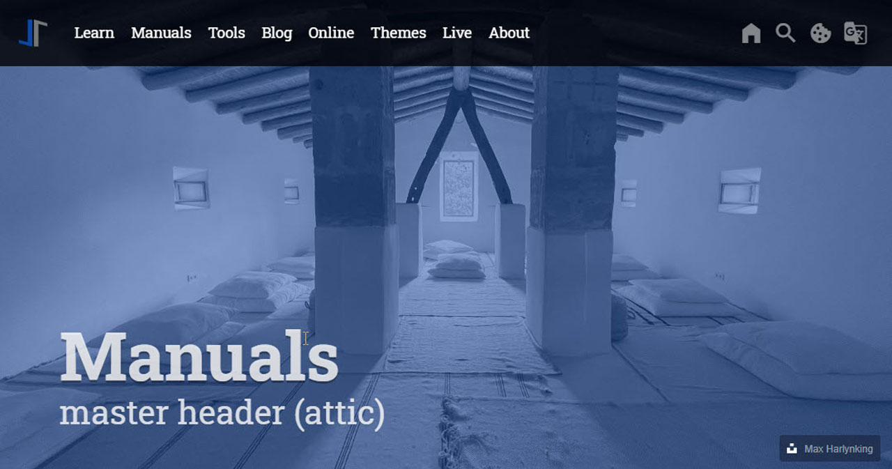
Following is an example of what a page-specific config may look like. Here the image gets altered, and an individual badge is configured for the author credits of the image used.
resource_options:
  - attic:
      padding_top:                      400
      padding_bottom:                   50
      opacity:                          0.5
      slides:
        - url:                          /assets/image/pages/tour/images-1920x1280-bw.jpg
          alt:                          Photo by Ricardo Gomez Angel on Unsplash
          title:                        Roundtrip
          tagline:                      present images
          badge:
            type:                       unsplash
            author:                     Ricardo Gomez Angel
            href:                       //unsplash.com/@ripato/portfolio
Configuration Parameters
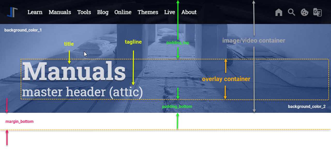
An master header always gets placed at the very top position of a page. Both header types, text and image headers, have some configuration parameters in common. See below for the general anatomy of a master header.
The common configuration parameters influence the following:
-
Size
-
Uplifting
-
Background color (Gradient)
-
Space between header and content
-
Placement, color, and emphasis of title and tagline
-
Animation settings (slideshows)
Anatomy of a Master Header
Find all these configuration parameters visually displayed in the following screenshot below. It might be helpful for a better understanding of the common header parameters described in section Common Config Parameters.
| The menu bar is placed as an overlay on top of the header. For details how to configure the overlay style of the menu-bar with a master header, see the |
Common Config Parameters
Common header parameters are used for both text-based and image-based headers. If no image configuration is given, the header is treated as a text-based header. Therefore, common header parameters can be regarded as Text Header parameters.
For J1 Theme pages, the Master Header parameters get configured in the YAML data file _data/modules/attics.yml. The default values are configured as follows:
# ------------------------------------------------------------------------------
# Default configuration settings
#
defaults:
  # ----------------------------------------------------------------------------
  # Global settings for text- and image-based attics
  #
  debug:                                false
  circuit:                              false
  notranslate:                          true
  pauseOnHover:                         false
  icon_family:                          MDI
  icon_color:                           "#9E9E9E"
  icon_size:                            default
  raised_level:                         0
  r_text:                               enabled
  text_emphasis:                        stronger
  padding_top:                          200
  padding_bottom:                       50
  margin_bottom:                        50
  title_size:                           3em
  title_color:                          rgba(255, 255, 255, 0.8)
  title_animate:                        animate__bounceInDown
  title_align:                          left
  tagline_size:                         1.5em
  tagline_color:                        rgba(255, 255, 255, 0.8)
  tagline_animate:                      animate__fadeInRight
  tagline_align:                        left
  # Gradient effect (background color)
  #
  background_color_1:                   "#0D47A1"
  background_color_2:                   "#0D47A1"
  action_enabled:                       false
  action_url:                           "#void"
  action_button:                        btn-default
  action_icon:                          download
  action_icon_family:                   MDI
  action_text:                          Download Now
  logo_enabled:                         false
  logo_url:                             /assets/image/modules/icons/j1/j1-512x512.jpg
  logo_alt:                             Jekyll-One-Template
  logo_height:                          196
  logo_animate:                         animate__slideInDown
See the following table for common parameters used for an master header, including a short description of what they are there for, what type they are, and what values are possible for their configuration.
| Parameter | Type | Default | Description |
|---|---|---|---|
| boolean |
| Enables or disables the translator (module) on the |
| Symbolic color | RGB valuess |
| Start value (color) for the gradient used for the header box background. Alternatively, the color can be configured as (hexadecimal) RGB valuess of the form |
| Symbolic color | RGB valuess |
| End value (color) for the gradient used for the header box background. Alternatively, the color can be configured as (hexadecimal) RGB valuess of the form |
| integer |
| Determine the distance, measured in pixel (px) from bottom position of the the header box to the first position of the following content |
| integer |
| Determines the distance, measured in pixel (px), from bottom position of the the overlay container to the bottom of the header box. In combination with |
| integer |
| Determines the distance, measured in pixel (px), from top position of the page and the overlay container that contains the title and tagline. In combination with |
| integer |
| Uplifting of the header element. Valid values are out of |
| string | no default | The tagline hash contains all name|value pairs to control how the page tagline is appears with the header |
| Position name (CSS) |
| Alignment of the tagline inside the overlay-container. Valid values are out of |
| string |
| Type of animation for the tagline. Valid values are all values supported by AnimateCSS. See Animate.css home page for details. |
| Symbolic color | RGB values |
| The text color. Should be given as an symbolic color name. Alternatively, the color can be configured as (hexadecimal) RGB valuess of the form |
| string |
| Symbolic value for the text size. Valid values are out of [ |
| string |
| Symbolic value for the text shadowing. Valid values are out of [ |
| string | no default | The title hash contains all name|value pairs to control how the page title appears with the header |
| Position name (CSS) |
| Alignment of the title inside the overlay-container. Valid values are out of |
| string |
| Type of animation for the title. Valid values are all values supported by AnimateCSS. See Animate.css home page for details. |
| Symbolic color | RGB value |
| The text color. Should be given as an symbolic color name. Alternatively, the color can be configured as (hexadecimal) RGB values of the form |
| string |
| Symbolic value for the text size. Valid values are out of [ |
Image and Video Header Parameters
The header component of J1 Themes integrates the jQuery plugin Backstretch for image- or video headers. Hence, image and video parameter belong to the Backstretch library.
| Name | Type | Default | Description |
|---|---|---|---|
| float or string |
| This parameter controls the horizontal alignment of the image. Can be one of |
| float or string |
| This parameter controls the vertical alignment of the image. Can be one of |
| string | no default | The alternative text for this image (for screen readers). |
| integer |
| The amount of time in between slides, when using Backstretch as a slideshow, expressed as the number of milliseconds. |
| string |
| Controls the scaling mode. Can be one of [ |
| string or array |
| Type of transition to use, when using Backstretch as a slideshow. If multiple transitions are specified as an array, then a transition value is chosen randomly. Example:
Can be one of:
|
| integer or string |
| This is the duration at which the image will transition in. Integers in milliseconds are accepted, as well as standard jQuery speed strings like |
| string (URL) | no default | The URL of the image or video. |
Additional Image Header Parameters
Copyright laws usually protect images from 3rd party sources. Depending on the respective license, you might be allowed to use them if the author or photographer is attributed correctly. As for most Creative Commons Licenses you need to mention the name of the author, the title of the work, if available, and a URL associated with it.
You can achieve this simply by placing a badge for a configurable URL on the image, and you’re done.
| Name | Type | Default | Description |
|---|---|---|---|
| boolean |
| Enables|Disables looping on image-based slideshows. |
| array | no defaults | Add (multiple) CSS3 filters on the image content. See section Available CSS3 Filter Functions for details. |
| Array | no default | If set, enables the placement of a badge for e.g. websites Copyright and | or Author information is requested or required. |
| String | unsplash | A badge of type |
| String | no default | The autors name. |
| String (URL) | no default | A URL that points e.g. to the image source, or a website for Copyright and | or Author information. |
Video Header Parameters
For video-based master headers, some additional configuration parameters control the video processing, like sound or the duration the video is playing.
| Name | Type | Default | Description |
|---|---|---|---|
| Boolean |
| Pass source type video to the plugin, if cannot be recognized automatically |
| Boolean |
| Enables|Disables looping on videos. If |
| Boolean |
| Enables | Disables sound on videos |
| String | no default | Specifying the |
Image and Video Transitions
If more than one image or video is given for a header, the header plays the configured items as a slide show.
Multiple Transitions
If multiple transitions are specified for the parameter transition, the transition is chosen randomly; this might be helpful, e.g., for demonstration purposes.
- url:          /assets/video/headers/still/ocean.jpg
  transition:   push_left|push_right|cover_up|cover_down|fade|fadeInOut
  ...
Available CSS3 Filter Functions
The filter property is specified as none or one or more of the functions listed below. If the parameter for any function is invalid, the function returns none. Except where noted, the functions that take a value expressed with a percent sign (as in 34%) also accept the value expressed as decimal (as in 0.34).
blur()
The blur() function applies a Gaussian blur to the input image. The value of radius defines the value of the standard deviation to the Gaussian function, or how many pixels on the screen blend into each other, so a larger value will create more blur. The initial value for interpolation is 0. The parameter is specified as a CSS length, but does not accept percentage values.
filters:
  blur:             50
brightness()
The brightness() function applies a linear multiplier to the input image, making it appear more or less bright. A value of 0% will create an image that is completely black. A value of 100% leaves the input unchanged. Other values are linear multipliers on the effect. Values of an amount over 100% are allowed, providing brighter results. The initial value for interpolation is 1.
filters:
  brightness:       0.3
contrast()
The contrast() function adjusts the contrast of the input image. A value of 0% will create an image that is completely gray. A value of 100% leaves the input unchanged. Values of an amount over 100% are allowed, providing results with more contrast. The initial value for interpolation is 1.
filters:
  contrast:         0.5
grayscale()
The grayscale() function converts the input image to grayscale. The value of amount defines the proportion of the conversion. A value of 100% is completely grayscale. A value of 0% leaves the input unchanged. Values between 0% and 100% are linear multipliers on the effect. The initial value for interpolation is 0.
filters:
    grayscale:      0.5
hue-rotate()
The hue-rotate() function applies a hue rotation on the input image. The value of angle defines the number of degrees around the color circle the input samples will be adjusted. A value of 0deg leaves the input unchanged. The initial value for interpolation is 0. Though there is no maximum value; the effect of values above 360deg wraps around.
filters:
  hue-rotate:       90
invert()
The invert() function inverts the samples in the input image. The value of amount defines the proportion of the conversion. A value of 100% is completely inverted. A value of 0% leaves the input unchanged. Values between 0% and 100% are linear multipliers on the effect. The initial value for interpolation is 0.
filters:
  invert:           0.6
opacity()
The opacity() function applies transparency to the samples in the input image. The value of amount defines the proportion of the conversion. A value of 0% is completely transparent. A value of 100% leaves the input unchanged. Values between 0% and 100% are linear multipliers on the effect. This is equivalent to multiplying the input image samples by amount. The initial value for interpolation is 1. This function is similar to the more established opacity property; the difference is that with filters, some browsers provide hardware acceleration for better performance.
filters:
  opacity:          0.5
saturate()
The saturate() function saturates the input image. The value of amount defines the proportion of the conversion. A value of 0% is completely un-saturated. A value of 100% leaves the input unchanged. Other values are linear multipliers on the effect. Values of amount over 100% are allowed, providing super-saturated results. The initial value for interpolation is 1.
filters:
  saturate:         200%
sepia()
The sepia() function converts the input image to sepia. The value of amount defines the proportion of the conversion. A value of 100% is completely sepia. A value of 0% leaves the input unchanged. Values between 0% and 100% are linear multipliers on the effect. The initial value for interpolation is 0.
filters:
  sepia:            1
Combining filter functions
You may combine any number of functions to manipulate the rendering. The following example enhances the contrast and brightness of the image:
  filters:
    grayscale:      0
    contrast:       1
    brightness:     0.8