J1 Theme ships with a Master Header Module for all content pages. A Master Header, a so-called Attic, always gets placed at the very top position of a page. All Master Header types provide a simple yet powerful text overlay technique to automatically present animated text taken from your content pages, or the header configuration in a page, for a title and a tagline.
The jQuery plugin Backstretch is the default library for image- and video-based headers. The full documentation, plus several examples, can be found at Backstretch Home Page. The Git repository is available at Github.
10-60 Minutes to read
| The Attic User Guide pages are based on the jQuery plugin Backstretch version v2.1.16 as shipped with the current J1 Template version 2026.x. The idea of providing this documentation is not to simply copy the original Backstretch pages as duplicates. For better readability and usability, all pages are restructured and enhanced by code examples or improved description texts. All parameter tables and all YAML examples on these pages were verified against the source files actually shipped with the template:
|
Overview
An Attic is the Master Header of a page: a colored or image-based banner that is always placed at the very top of a page, directly under the menu bar. It presents the title and the tagline of a page as animated text overlays, and it can display one or more background images or videos as a slideshow.
You normally do not write any JavaScript to use an attic. Instead, you write a few YAML settings, and the J1 attic adapter (~/assets/theme/j1/adapter/js/attic.js) reads those settings and builds the JavaScript configuration for the underlying library for you. For image- and video-based headers, this library is the jQuery plugin Backstretch (~/assets/theme/j1/modules/backstretch/js/backstretch.js), which takes care of loading, resizing, and animating the background media.
The configuration is collected from four places and merged in this order (later values overwrite earlier ones):
-
Default values (
_data/modules/defaults/attics.yml, sectiondefaults) -
Global user values (
_data/modules/attics.yml, sectionsettings) -
Layout-specific values (
_data/modules/attics.yml, sectionsettings.attics) -
Page-specific values (front matter of a page)
This way, you can define one look for your whole site, adjust it per layout (for example, home page vs. blog posts), and still give a single page its very own header when needed.
How an Attic is Built
You do not have to call the module yourself. The J1 Template starts the attic module automatically for every page. Knowing the steps it takes is still useful, because it explains a few things you will notice on your pages — like the short moment a page stays blank while it loads.
-
Wait for the page. The module waits until the page container becomes visible. If that never happens (for example, because a browser extension hides the page), the module gives up after 5 seconds and writes a warning to the browser console instead of waiting forever.
-
Hide the page. If
hide_page_oninitistrue(the default), the page is hidden for a moment. This avoids a visible "jump" of the content while the header image is still loading. Search engines rate such a jump as a bad Cumulative Layout Shift (CLS) score. -
Merge the settings. Defaults, layout settings, and page settings are merged into one single set of options.
-
Start Backstretch. The background image or video is loaded, scaled, and placed in the header container.
-
Add the text overlay. Title, tagline, and — if configured — the badge are written into the header and the animations are started.
-
Show the page. The page is made visible again.
| Set |
Header Types
Attics are available as simple, text-based headers as well as headers displaying images and videos supporting all common image and video formats. Besides static images, video clips (online videos and HTML5 videos) are supported for a more eye-catching experience.
Text-based Header
A simple, text-based master header is quite useful for common content pages. This header type supports a colored background — a gradient between two configurable colors — and animated text overlays for both the title and the tagline of a page. Because no image needs to be loaded, text-based headers are the fastest option.
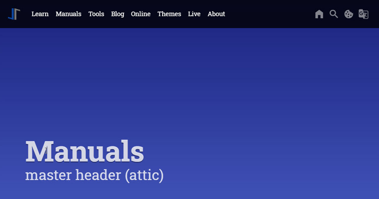
Image-based Header
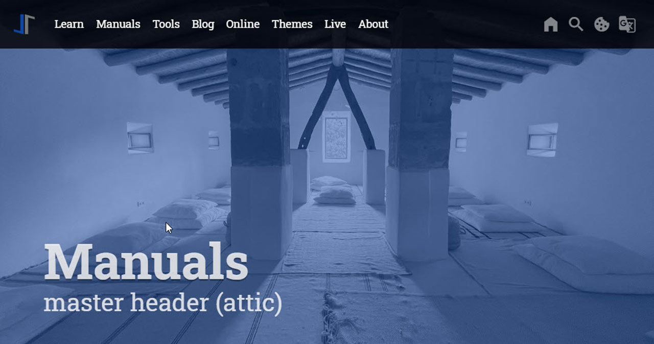
An image-based master header is characterized by dynamically-resizable, slideshow-capable background images or videos. The image (or video) stretches the width full-size and will get resized automatically if the page size changes. Image-based attics are fully responsive and display excellent quality on devices like desktop computers, tablets, or mobiles.
If more than one slide is configured, the attic plays the slides as a slideshow using the configured transition effect; see section Image and Video Transitions for all available effects.
Video-based Header
A video-based master header works exactly like an image-based header, but plays a moving background instead of a still picture. Two kinds of video sources are supported:
-
Local video — a video file stored on your own website, for example an
MP4file. The browser plays it with the built-in HTML5 video element. -
Online video — a YouTube link. The module recognizes a YouTube address automatically and loads the YouTube player for you.
Because a header video plays in the background it has no playback controls, and it is muted by default. This is not a limitation of the J1 Template — browsers refuse to auto-play a video that produces sound. Use the parameter sound (or mute) if you really want the audio track, and be aware that most browsers will then block the auto-start.
| Keep header videos short and small. A video is downloaded before it can play, so a large file delays the whole page. A clip of a few seconds that loops ( |
Header Configuration
The header module of J1 Theme allows multiple headers for your Web. Generally, a header is related to a layout and can also be individualized on a per page basis.
The module supports setting up as many different headers as layouts exist. Thus, the header on the home page (layout home) may be different from the header used for pages (layout page), posts (layout post), or collections (layout collection).
While you can provide a common header for all content pages that belong to a certain layout, you can further individualize a header configuration on a per page basis for pages that should have a unique header.
| If no attic is assigned to a layout, all pages based on this layout will have no top page header. In this case, a small fake attic (CSS class |
Configuration parameters are being processed in the following order:
-
Default values
-
Layout-specific values
-
Page-specific values
The word processed means: the module starts with the default values and then overwrites them, step by step, with the values found in the next layer. A value you do not set simply keeps the value of the layer before. You therefore never need to repeat settings — you only write down what should be different.
| Step | Layer | File |
|---|---|---|
1 | Default value shipped with the template |
|
2 | Global user setting, valid for your whole site |
|
3 | Layout setting, valid for all pages using that layout |
|
4 | Page setting, valid for this one page only |
|
| The last layer wins. A |
General Configuration
In a J1 Theme page, the header module gets configured by two YAML data files:
-
_data/modules/defaults/attics.yml— the default settings shipped with the template. You should not change this file; it documents all available parameters and their default values. -
_data/modules/attics.yml— the user settings for your site. All values you place here overload (overwrite) the defaults of the same name.
The defaults file consists of three sections:
-
General header settings (text- and image-based headers)
-
Global image settings (image-based headers only)
-
Layout-specific header settings (text- and image-based headers)
The following (shortened) listing shows the general section of the default settings:
defaults/attics.yml (excerpt)# ------------------------------------------------------------------------------
# Default configuration settings
#
defaults:
# ----------------------------------------------------------------------------
# GENERAL options (for text- and image-based header)
#
enabled: false
debug: false
hide_page_oninit: true
circuit: false
notranslate: true
pauseOnHover: false
icon_family: mdib
icon_color: var(--md-gray-500)
icon_size: default
raised_level: 0
r_text: enabled
text_emphasis: stronger
padding_top: 400
padding_bottom: 50
margin_bottom: 50
title_size: 3em
title_color: rgba(255, 255, 255, 0.8)
title_align: left
title_animate: animate__bounceInDown
title_animate_delay: false
title_animate_duration: animate__slow
tagline_size: 1.5em
tagline_color: rgba(255, 255, 255, 0.8)
tagline_align: left
tagline_animate: animate__fadeInRight
tagline_animate_delay: false
tagline_animate_duration: animate__slow
# duo-color effect, base color 'blue' (requires gray-scaled images)
#
background_color_1: var(--md-blue-900)
background_color_2: var(--md-blue-900)
# placeholder slide, used if NO slides given in FRONTMATTER (of a page|post)
#
slides:
- url: /assets/image/module/attic/../transparent-1920x1280.png
alt: Placeholder background image
# CSS filter setting applied on (backstretch|background) image
#
filters:
grayscale: 1
contrast: 0.8
brightness: 0.8| The two background colors form a gradient. If both colors are set to the same value (like |
Layout-specific Configuration
The configuration of the layout-specific headers can be found in the user settings file _data/modules/attics.yml. The attics configuration array organizes layout-specific header settings. This array consists of key-value pairs (hashes), one per layout. Each header gets configured by a unique header id dedicated for a layout (or a list of layouts).
| Layout-specific headers use the same key-value pairs as specified by the default section. Technically, a layout-specific header configuration overloads all the parameters (by key) already specified by their defaults. |
attics.yml# ------------------------------------------------------------------------------
# SETTINGS
#
settings:
# ----------------------------------------------------------------------------
# GLOBAL options
#
# CSS filter setting applied on (backstretch|background) image
#
filters:
grayscale: 0
contrast: 1
brightness: 1
# ----------------------------------------------------------------------------
# GENERAL options
#
enabled: true
# ----------------------------------------------------------------------------
# Layout specific properties
#
attics:
# --------------------------------------------------------------------------
# Home page
#
- name: Home
attic:
enabled: true
id: attic_home
layout: home
title_animate: animate__bounceInDown
title_animate_duration: animate__fast
tagline_animate: animate__fadeInRight
tagline_animate_duration: animate__slow
padding_top: 600
# --------------------------------------------------------------------------
# Pages
#
- name: Pages
attic:
enabled: true
id: attic_page
layout: page
padding_top: 600
# --------------------------------------------------------------------------
# Posts
#
- name: Posts
attic:
enabled: true
id: attic_post
layout: [ collection, post ]
title_animate: animate__fadeInDown
padding_top: 600Page-specific Configuration
The config data (key-value pairs) for a page-specific master header configuration are to be set in the front matter of a page by the element resource_options.
Following is an example of what a page-specific config may look like. Here the image gets altered, and an individual badge is configured for the author credits of the image used.
resource_options:
  - attic:
      padding_top:                      400
      padding_bottom:                   50
      opacity:                          0.5
      slides:
        - url:                          /assets/image/page/tour/images-1920x1280-bw.jpg
          alt:                          Photo by Ricardo Gomez Angel on Unsplash
          title:                        Roundtrip
          tagline:                      present images
          badge:
            type:                       unsplash
            author:                     Ricardo Gomez Angel
href: //unsplash.com/@ripato/portfolio| If a page does not configure any |
The Slides Array
The slides array holds the background media of a header. Each entry of the array is one slide. A single entry gives a static header; two or more entries turn the header into a slideshow.
Beside the media itself, a slide can carry its own title, tagline, and credits. Values given on a slide are used while that slide is visible and overrule the values of the page.
| Key | Type | Description |
|---|---|---|
| string | Required. Address of the image or video file. May also be a YouTube address for a video header. |
| string | Alternative text of the image. Screen readers read this text aloud, so please describe what can be seen on the picture. |
| string | Replaces the page title in the text overlay while this slide is shown. |
| string | Replaces the page tagline in the text overlay while this slide is shown. |
| hash | Credits for the author of the media. See section Additional Header Parameters. |
| hash | A free text (key |
| boolean | Set to |
| boolean, boolean, string | Video-only keys. See section Video Header Parameters. |
| string, integer | Override the transition effect and the display time for this one slide. |
| float or string | Override the position and the scaling mode for this one slide, for example to keep a face visible on a portrait photo. |
Video Header Configuration
A video header is configured like an image header, with one addition: the header type is set to video. The module then switches the library into video mode and derives the video-related settings for you.
home) - name: Home
attic:
enabled: true
id: attic_home
layout: home
type: video
# play the clip over and over again
loop: true
# sound: false (the default) mutes the video. Browsers block the
# auto-start of videos that play sound.
sound: false
padding_top: 600
slides:
- url: /assets/video/headers/present_videos/ocean.mp4
alt: Ocean waves
poster: /assets/video/poster/ocean.jpg| The keys |
Opacity
Opacity controls the transparency of a header image or video, but is specific to the J1 Template and are not part of the official Backstretch library.
|
|
| Parameter | Type | Default | Description |
|---|---|---|---|
| float [0 .. 1.0] | 0.5 | Transparency of the background media, given as a number between |
Configuration Parameters
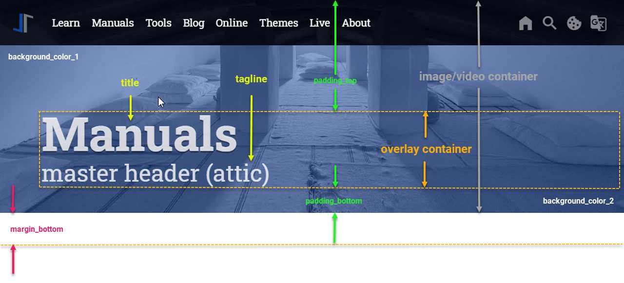
A master header always gets placed at the very top position of a page. Both header types, text and image headers, have some configuration parameters in common. See below for the general anatomy of a master header.
The common configuration parameters influence the following:
-
Size
-
Uplifting
-
Background color (Gradient)
-
Space between header and content
-
Placement, color, and emphasis of title and tagline
-
Animation settings (slideshows)
Anatomy of a Master Header
Find all these configuration parameters visually displayed in the following screenshot below. It might be helpful for a better understanding of the common header parameters described in section Common Config Parameters.
| The menu bar is placed as an overlay on top of the header. For details how to configure the overlay style of the menu-bar with a master header, see the |
Common Config Parameters
Common header parameters are used for both text-based and image-based headers. If no image configuration is given, the header is treated as a text-based header. Therefore, common header parameters can be regarded as Text Header parameters.
For J1 Theme pages, the Master Header parameters get configured in the YAML data file _data/modules/defaults/attics.yml. The (general) default values are configured as follows:
# ------------------------------------------------------------------------------
# Default configuration settings
#
defaults:
  # ----------------------------------------------------------------------------
  # GENERAL options (for text- and image-based header)
  #
  enabled:                              false
  debug:                                false
  hide_page_oninit:                     true
  circuit:                              false
  notranslate:                          true
  pauseOnHover:                         false
  icon_family:                          mdib
  icon_color:                           var(--md-gray-500)
  icon_size:                            default
  raised_level:                         0
  r_text:                               enabled
  text_emphasis:                        stronger
  padding_top:                          400
  padding_bottom:                       50
  margin_bottom:                        50
  title_size:                           3em
  title_color:                          rgba(255, 255, 255, 0.8)
  title_align:                          left
  title_animate:                        animate__bounceInDown
  title_animate_delay:                  false
  title_animate_duration:               animate__slow
  tagline_size:                         1.5em
  tagline_color:                        rgba(255, 255, 255, 0.8)
  tagline_align:                        left
  tagline_animate:                      animate__fadeInRight
  tagline_animate_delay:                false
  tagline_animate_duration:             animate__slow
  # duo-color effect, base color 'blue' (requires gray-scaled images)
  #
  background_color_1:                   var(--md-blue-900)
background_color_2: var(--md-blue-900)| The animations used on the title and the tagline are taken from the library Animate.css. All animation names ( |
See the following tables for the common parameters of a master header. Each table covers one topic and lists, for every parameter, a short description of what it is good for, the type of value it expects, and the value shipped as the default.
| The column Default always shows the value shipped in |
Switches
Switches are the yes/no settings of a header. Each of them accepts only the values true or false — there is nothing to measure and nothing to name, you simply turn a feature on or off.
Two of them decide whether you get a header at all. The parameter enabled in _data/modules/attics.yml switches the whole module on for your site, and a second enabled inside each layout entry switches the header on for the pages of that layout. Both have to be true, otherwise the page shows the small fake attic (CSS class no-attic) instead, which only reserves some space below the menu bar.
The remaining switches change how a running header behaves: whether the page is hidden while the header is built, whether a slideshow starts over after the last slide, whether it pauses under the mouse pointer, and whether the header texts are offered to the translator module.
|
|
| Parameter | Type | Default | Description |
|---|---|---|---|
| boolean | false | The master switch of the module. As long as this is |
| boolean | false | If |
| boolean | true | If |
| boolean | true | Excludes the |
| boolean | false | Controls what happens after the last slide of a slideshow. If |
| boolean | false | If |
| string | enabled | Switches responsive text on for the header. With |
Size and Position
A header box has no height of its own. Its height is produced by the two paddings: padding_top pushes the text overlay down from the top of the page, and padding_bottom adds some room underneath it. Added together, the two values are the height of your header. With the shipped defaults (400 + 50) a header is therefore 450 pixels tall.
The third distance, margin_bottom, is outside the box. It sets the gap between the lower edge of the header and the first line of your page content.
All three values are written in pixels, without a unit — write 600, not 600px. The module turns them into a CSS rule and adds it to the page while the header is being built.
Two more settings belong to the appearance of the box rather than to its size: raised_level adds a shadow so the header looks lifted off the page, and opacity decides how strongly the background image is shown.
| A good starting point is |
| Parameter | Type | Default | Description |
|---|---|---|---|
| integer | 400 | Distance in pixels between the top of the page and the text overlay that holds title and tagline. Together with |
| integer | 50 | Distance in pixels between the bottom of the text overlay and the bottom edge of the header box. |
| integer | 50 | Distance in pixels between the bottom edge of the header box and the first line of the page content. |
| integer | 0 | Makes the header look lifted above the page by adding a shadow around it. Valid values are |
| float | 0.5 | Transparency of the background image or video, from |
| string (CSS class) | false | false | Name of a CSS class shown while the background media is still loading. With the shipped default |
Background Color
Every header box has a colored background, even if you never configure a picture. The color is a gradient: it starts at the top of the box with background_color_1 and ends at the bottom with background_color_2, changing smoothly in between.
If you give the same value to both parameters, the gradient disappears and you get a plain, evenly colored box. This is what the shipped defaults do — both are set to var(--md-blue-900).
You may write the colors in any spelling the browser understands: a J1 color variable such as var(--md-blue-900), a hexadecimal value of the form #RRGGBB, or an rgba(…) value with a transparency part.
For a text-based header, the gradient is all your visitors see, so it is worth spending a moment on it. For an image-based header, the gradient sits behind the picture and shines through it as far as the opacity setting allows.
| Parameter | Type | Default | Description |
|---|---|---|---|
| CSS color | var(--md-blue-900) | Start color of the background gradient of the header box. Accepts any valid CSS color: a J1 color variable such as |
| CSS color | var(--md-blue-900) | End color of the background gradient, running from top to bottom. If both colors are the same, the result is a solid, single-colored background. |
| The background color is not hidden by a background image — it shines through it, as far as the |
Title and Tagline
Title and tagline are the two lines of text placed on the header. Every parameter exists twice, once with the prefix title_ and once with the prefix tagline_, and both work in exactly the same way.
| Parameter | Type | Default | Description |
|---|---|---|---|
| CSS length | 3em | Size of the text, given as a CSS length such as |
| CSS color | rgba(255, 255, 255, 0.8) | Color of the text. Accepts a J1 color variable, a hexadecimal value of the form |
| string | left | Horizontal position of the text inside the header box. One of |
| string | animatebounceInDown | Name of the entrance animation played when the text appears. All class names of the Animate.css library are accepted, always written with the |
| string | false | false | Waiting time before the animation starts, given as an Animate.css delay class such as |
| string | false | animate__slow | Speed of the animation, given as an Animate.css duration class: |
| string | stronger | Strength of the shadow drawn behind title and tagline. One of |
How Title and tagline setting work
Title and tagline settings can be written in two spellings, and — this is important — the two spellings are not interchangeable everywhere:
- Flat spelling, one key per setting
-
title_size: 3em title_color: rgba(255, 255, 255, 0.8) - Hash spelling, one
title:key with sub-keys -
title:
  size:                                 3em
  color:                                rgba(255, 255, 255, 0.8)
Which one you have to use depends on where you write it:
| Where | Flat spelling | Hash spelling |
|---|---|---|
Global section | yes | no |
Global section | yes | no |
A layout entry under | no | yes |
| no | yes |
| A flat The same applies to the front matter of a page: write |
    - name:                             Posts
      attic:
        enabled:                        true
        id:                             attic_post
        layout:                         [ collection, post ]
        # hash spelling is required here
        title:
          animate:                      animate__fadeInDown
          align:                        center
        # flat spelling is correct for these
        padding_top:                    600
text_emphasis: strongest| The four timing settings |
Image and Video Header Parameters
The header component of J1 Themes integrates the jQuery plugin Backstretch for image- or video headers. Hence, image and video parameters belong to the Backstretch library. All parameters listed in this section can be set globally (in the YAML data files) or per slide (in the slides array of a page’s front matter).
| Name | Type | Default | Description |
|---|---|---|---|
| float or string | 0.5 | This parameter controls the horizontal alignment of the image. Can be one of |
| float or string | 0.5 | This parameter controls the vertical alignment of the image. Can be one of |
| boolean | false | Decides what is measured when the module checks whether a larger or smaller version of the media is needed: the browser window ( |
| string | no default | The alternative text for this image (for screen readers). |
| integer | 5000 | The amount of time in between slides, when using Backstretch as a slideshow, expressed as the number of milliseconds. |
| string | cover | Decides how the media is fitted into the header box. One of: * An unknown value falls back to |
| string or array | fadeInOut | Type of transition to use, when using Backstretch as a slideshow. If multiple transitions are specified as an array, then a transition value is chosen randomly. Example:
Can be one of: * |
| integer or string | normal | This is the duration at which the image will transition in. Integers in milliseconds are accepted, as well as standard jQuery speed strings like |
| string (URL) | no default | The URL of the image or video. |
Additional Header Parameters
Copyright laws usually protect images from 3rd party sources. Depending on the respective license, you might be allowed to use them if the author or photographer is attributed correctly. As for most Creative Commons Licenses you need to mention the name of the author, the title of the work, if available, and a URL associated with it.
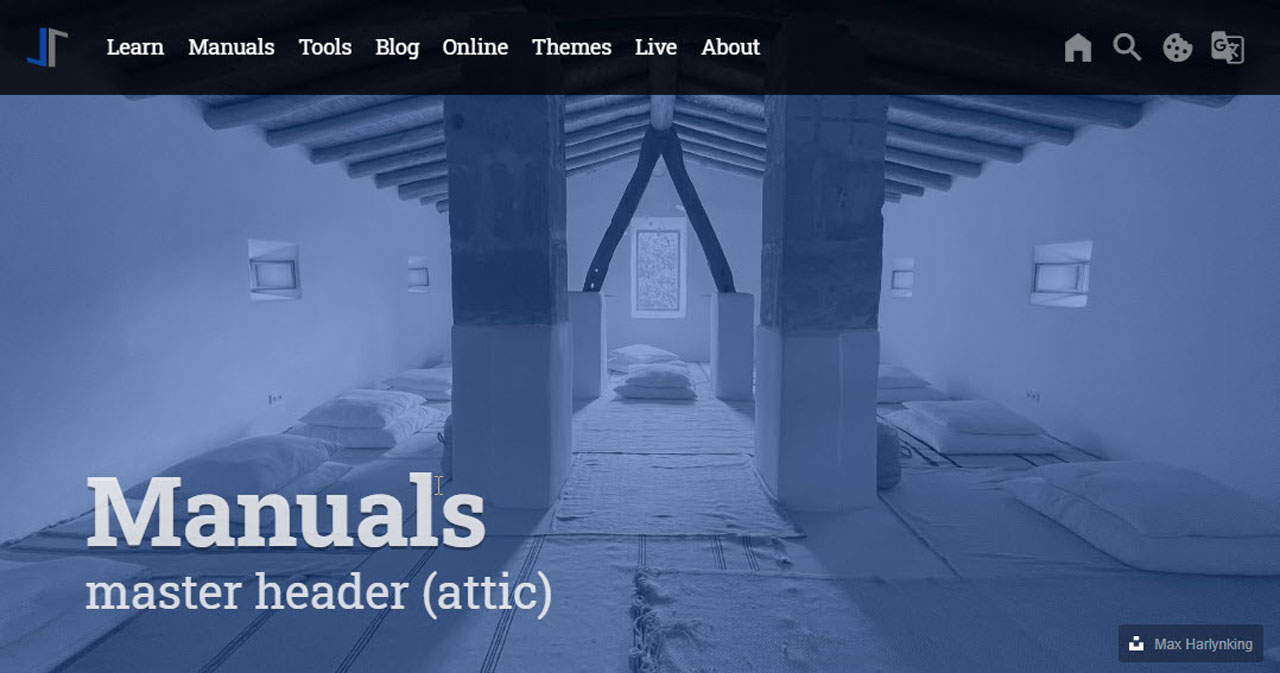
You can achieve this simply by placing a badge for a configurable URL on the image, and you’re done.
| Name | Type | Default | Description |
|---|---|---|---|
| boolean | false | Enables|Disables looping on image-based slideshows. |
| array | no defaults | Add (multiple) CSS3 filters on the image content. See section CSS3 Filter for details. |
| Array | no default | If set, places a free text in the corner of the header instead of a badge. A |
| String | no default | The text shown in the caption. |
| URL (String) | no default | If given, the caption text becomes a link pointing to this address. The link opens in a new browser tab. |
| Array | no default | If set, enables the placement of a badge for e.g. websites Copyright and | or Author information is requested or required. |
| ai | unsplash | unsplash | Selects the icon drawn on the badge. Two types are available: |
| String | no default | The name of the author or photographer, shown as the text of the badge. |
| String | Image | The kind of work the credit is given for. Used to build the tooltip of the badge, for example |
| String (URL) | no default | A URL that points e.g. to the image source, or a website for Copyright and | or Author information. |
Video Header Parameters
For video-based master headers, some additional configuration parameters control the video processing, like sound or the duration the video is playing.
| Name | Type | Default | Description |
|---|---|---|---|
| Boolean | false | Pass source type video to the plugin, if cannot be recognized automatically |
| Boolean | false | Enables|Disables looping on videos. If |
| Boolean | false | Switches the sound of a video off. The shipped default reads |
| String | no default | Address of a still image shown before the video starts to play. Without a poster the header stays empty for a moment on slow connections |
| String | no default | Set to |
| Boolean | false | The J1-level counterpart of |
| A video header does not have to be a file on your own website. If the Header videos never show playback controls, because they are background media. The parameters |
Image and Video Header Defaults
The image- and video-related settings of the Backstretch library have the following default values (see the global section for image-based attics in the file _data/modules/defaults/attics.yml):
| Parameter | J1 default | Library default | Description |
|---|---|---|---|
| 0.5 | 0.5 | Horizontal alignment of the media. One of |
| 0.5 | 0.5 | Vertical alignment of the media. One of |
| false | false | Measure the browser window instead of the header box when deciding whether a larger or smaller version of the media is needed |
| false | true | If |
| false | not set | Do not add any CSS styles to the |
| 5000 | 5000 | Time a slide stays visible before the next one follows, in milliseconds |
| false | not set | Tell the library that the media is a video, in case the file name does not make that clear |
| false | not set | Play a video over and over again. If |
| false | not set | Play a video without sound. See the note below — a video header is muted in practice even though this default reads |
| 0.5 | not set | Transparency of the media, from |
| false | false | Start the header with a stopped slideshow |
| 5 | 2 | How many slides are loaded ahead of time |
| 1 | 1 | How many slides are loaded in parallel |
| 0.1 | 0.1 | How large a size change has to be before another resolution of the media is loaded |
| 2500 | 2500 | How long the module waits, in milliseconds, before it switches to another resolution |
| cover | not set | How the media is fitted into the header box. One of |
| false | not set | CSS class of a loading animation added while the media is still on its way. A J1 setting, not part of the Backstretch library |
| 0 | 0 | Index of the slide shown first. Counting starts at |
| fadeInOut | fade | Effect used to change from one slide to the next. See section Image and Video Transitions |
| normal | 0 | How long the transition takes. Integers count as milliseconds; the jQuery speed names |
| The column J1 default holds the value shipped in
A special case is |
Image and Video Transitions
If more than one image or video is given for a header, the header plays the configured items as a slide show. The parameter transition selects the visual effect used to change from one slide to the next.
| Transition | Description |
|---|---|
| The new slide enters from the top edge and moves downwards over the current slide. The current slide does not move; it stays in place and gets covered step by step. The transition is finished when the new slide completely overlays the old one. |
| The new slide enters from the right edge and moves to the left over the current slide. The current slide does not move; it stays in place and gets covered step by step. The transition is finished when the new slide completely overlays the old one. |
| The new slide enters from the left edge and moves to the right over the current slide. The current slide does not move; it stays in place and gets covered step by step. The transition is finished when the new slide completely overlays the old one. |
| The new slide enters from the bottom edge and moves upwards over the current slide. The current slide does not move; it stays in place and gets covered step by step. The transition is finished when the new slide completely overlays the old one. |
| The new slide is faded in as an overlay on top of the current slide. While the new slide becomes more and more visible, the current slide is still shown underneath, so both slides blend smoothly into each other (a classic cross-fade). This is the default transition; unknown transition names automatically fall back to |
| The current slide is first faded out completely, then the new slide is faded in. In between, the background (color) of the header becomes visible for a short moment. Each fade uses half of the configured transition duration, so the total time matches the |
| The new slide enters from the top edge and moves downwards, pushing the current slide out of the view at the same time. Both slides move together like connected panels. The transition is finished when the old slide has left the view at the bottom. |
| The new slide enters from the right edge and moves to the left, pushing the current slide out of the view at the same time. Both slides move together like connected panels. The transition is finished when the old slide has left the view on the left-hand side. |
| The new slide enters from the left edge and moves to the right, pushing the current slide out of the view at the same time. Both slides move together like connected panels. The transition is finished when the old slide has left the view on the right-hand side. |
| The new slide enters from the bottom edge and moves upwards, pushing the current slide out of the view at the same time. Both slides move together like connected panels. The transition is finished when the old slide has left the view at the top. |
Multiple Transitions
If multiple transitions are specified for the parameter transition, the transition is chosen randomly; this might be helpful, e.g., for demonstration purposes.
- url:          /assets/video/headers/still/ocean.jpg
  transition:   push_left|push_right|cover_up|cover_down|fade|fadeInOut
...| Transition names are accepted in two spellings: camelCase (like |
CSS3 Filter
Using the filters parameter, one or more CSS3 Filter can be applied on the background image of an attic — for example, to convert a colored image to grayscale, or to darken an image so that the title text stays readable.
The filter property is specified as none or one or more of the functions listed below. If the parameter for any function is invalid, the function returns none. Except where noted, the functions that take a value expressed with a percent sign (as in 34%) also accept the value expressed as decimal (as in 0.34).
| The value you write in YAML is passed to the browser exactly as you typed it. A filter function that needs a unit must therefore be given with that unit — This matters more than it may look: if one filter in the list is invalid, the browser silently ignores all of them, and your header simply shows the unfiltered image. Nothing appears in the console. If your filters seem to have no effect at all, a missing unit is the first thing to check. Filters that take a proportion — |
How the Filter List is built
Every entry of the filters hash becomes one CSS filter function. The key is used as the function name, and the value is put in brackets behind it. All entries are then joined with a blank into a single line, which the module hands over to the browser.
This YAML setting:
filters:
  grayscale:        1
  contrast:         0.8
  brightness:       0.8
produces this CSS:
filter: grayscale(1) contrast(0.8) brightness(0.8);Two things follow from this. First, the key has to be spelled exactly like the CSS function — hue-rotate, not hueRotate or hue_rotate. Second, nothing checks your spelling: a wrong key simply produces a function the browser does not know, and the browser then drops the whole filter line.
blur()
The blur() function applies a Gaussian blur to the input image. The value of radius defines the value of the standard deviation to the Gaussian function, or how many pixels on the screen blend into each other, so a larger value will create more blur. The initial value for interpolation is 0. The parameter is specified as a CSS length, but does not accept percentage values.
filters:
  blur:             5px
brightness()
The brightness() function applies a linear multiplier to the input image, making it appear more or less bright. A value of 0% will create an image that is completely black. A value of 100% leaves the input unchanged. Other values are linear multipliers on the effect. Values of an amount over 100% are allowed, providing brighter results. The initial value for interpolation is 1.
filters:
  brightness:       0.3
contrast()
The contrast() function adjusts the contrast of the input image. A value of 0% will create an image that is completely gray. A value of 100% leaves the input unchanged. Values of an amount over 100% are allowed, providing results with more contrast. The initial value for interpolation is 1.
filters:
  contrast:         0.5
grayscale()
The grayscale() function converts the input image to grayscale. The value of amount defines the proportion of the conversion. A value of 100% is completely grayscale. A value of 0% leaves the input unchanged. Values between 0% and 100% are linear multipliers on the effect. The initial value for interpolation is 0.
filters:
    grayscale:      0.5
hue-rotate()
The hue-rotate() function applies a hue rotation on the input image. The value of angle defines the number of degrees around the color circle the input samples will be adjusted. A value of 0deg leaves the input unchanged. The initial value for interpolation is 0. Though there is no maximum value; the effect of values above 360deg wraps around.
filters:
  hue-rotate:       90deg
invert()
The invert() function inverts the samples in the input image. The value of amount defines the proportion of the conversion. A value of 100% is completely inverted. A value of 0% leaves the input unchanged. Values between 0% and 100% are linear multipliers on the effect. The initial value for interpolation is 0.
filters:
  invert:           0.6
opacity()
The opacity() function applies transparency to the samples in the input image. The value of amount defines the proportion of the conversion. A value of 0% is completely transparent. A value of 100% leaves the input unchanged. Values between 0% and 100% are linear multipliers on the effect. This is equivalent to multiplying the input image samples by amount. The initial value for interpolation is 1. This function is similar to the more established opacity property; the difference is that with filters, some browsers provide hardware acceleration for better performance.
filters:
  opacity:          0.5
saturate()
The saturate() function saturates the input image. The value of amount defines the proportion of the conversion. A value of 0% is completely un-saturated. A value of 100% leaves the input unchanged. Other values are linear multipliers on the effect. Values of amount over 100% are allowed, providing super-saturated results. The initial value for interpolation is 1.
filters:
  saturate:         200%
sepia()
The sepia() function converts the input image to sepia. The value of amount defines the proportion of the conversion. A value of 100% is completely sepia. A value of 0% leaves the input unchanged. Values between 0% and 100% are linear multipliers on the effect. The initial value for interpolation is 0.
filters:
  sepia:            1
drop-shadow()
The drop-shadow() function draws a shadow behind the visible shape of the image. Unlike a normal box shadow it follows transparent areas, so a logo saved as a transparent PNG gets a shadow around the logo itself and not around its rectangle.
The value is written like a CSS shadow: horizontal offset, vertical offset, blur radius, and color. Offsets and radius are lengths and need a unit.
filters:
  drop-shadow:      4px 4px 10px rgba(0, 0, 0, 0.5)
Combining Filter Functions
You may combine any number of functions to manipulate the rendering. The following example enhances the contrast and brightness of the image.
| Filters are applied in the order you write them, and each one works on the result of the one before. Filters set for a layout are merged with your global filters rather than replacing them. You can therefore add a single extra effect for one layout without repeating the settings that should stay the same. |
  filters:
    grayscale:      0
    contrast:       1
brightness: 0.8| The user settings file |
Programming Interface
Everything described so far is done with settings. For a normal website that is all you need — the module starts on its own, reads your YAML files, and builds the header.
Sometimes you want a little more: a button that jumps to the next slide, a header that stops when a visitor opens a dialog, or a message in the console when the header is ready. For those cases the module offers a small programming interface.
| This chapter is for readers who want to write a few lines of JavaScript themselves. You can skip it completely if you only configure your header through YAML settings. Nothing described here is required to use an attic. |
The Attic Adapter
The J1 adapter is available in the browser as j1.adapter.attic. It is the part of the template that reads your settings and starts the library. It offers the following methods.
| Method | Arguments | Description |
|---|---|---|
|
| Starts the module. The template calls this method for you when the page loads, passing the header settings taken from the front matter of the page. You should not call it yourself. |
| none | Builds every header configured for the current page. Called by |
| none | Returns the current processing state of the module as a string. See the table of states below. |
|
| Sets the processing state. Used internally by the module while it works. |
|
| Receives messages sent by other J1 modules. Part of the common module interface of the template; you do not normally call it directly. |
Processing States
The module reports what it is doing through a state. Reading the state is the safest way to find out whether a header is finished, because the header is built after the rest of the page.
| State | Meaning |
|---|---|
| The module exists but has not been called yet. |
|
|
| The page is visible. The module begins to build the headers. |
| The settings are merged and the CSS rules are written. The background media is about to be loaded. |
| A slide is about to be exchanged. The text overlay and the badge are hidden for the moment of the change. |
| A slide has arrived. Title, tagline, badge, and the animations are put back in place. |
| The header is complete and the page is visible again. |
// run your own code as soon as the header is complete
var atticReady = setInterval(function () {
  if (j1.adapter.attic.getState() === 'finished') {
    clearInterval(atticReady);
    // your code goes here
    console.log('the master header is ready');
  }
}, 100);| If your code never runs, the header probably never reached the state |
Slideshow Methods
A header with more than one slide is a slideshow, and a slideshow can be controlled from your own code. The commands are sent to the header container through jQuery, using the id of the header — the same id you gave the attic in _data/modules/attics.yml, for example attic_home.
| These methods only make sense for headers that show background media. A purely text-based header has no slides, so there is nothing to advance, pause, or resize. |
| Method | Arguments | Description |
|---|---|---|
| none | Shows the next slide. After the last slide it starts again at the first. |
| none | Shows the previous slide. On the first slide it jumps to the last one. |
|
| Shows one particular slide. Counting starts at |
| none | Stops the slideshow on the slide currently visible. |
| none | Continues a paused slideshow. |
| none | Measures the header box again and rescales the media. Call this after you changed the size of the header yourself. The module calls it automatically when the browser window is resized. |
|
| Removes the header completely. Pass |
// jump to the next slide
$('#attic_home').backstretch('next');
// show the third slide (counting starts at 0)
$('#attic_home').backstretch('show', 2);
// stop and continue
$('#attic_home').backstretch('pause');
$('#attic_home').backstretch('resume');|
|
Events
The header announces what it does by firing events. Listening to an event is more reliable than waiting a fixed number of seconds, because it tells you the exact moment something happened.
All events are fired on the window object and receive the same three arguments.
| Event | Fired when |
|---|---|
| A slide is about to be shown. Use it to hide your own elements while the picture changes. |
| A slide has been shown and the transition has finished. Use it to bring your own elements back, or to read the data of the slide now visible. |
| The media has been rescaled, because the browser window changed its size or because |
| Argument | Type | Description |
|---|---|---|
| jQuery event | The event object itself. |
| object | The header instance. Its property |
| integer | Position of the slide concerned, counting from |
| The J1 adapter itself listens to |
$(window).on('backstretch.after', function (event, instance, index) {
  var slide = instance.images[index];
  // 'slide' holds the YAML settings of the slide now visible,
  // for example slide.url, slide.alt, slide.title, slide.tagline
  console.log('now showing slide ' + index + ': ' + slide.alt);
});
Troubleshooting
The table below lists the problems reported most often, together with the message the module writes to the browser console.
| Three of the four messages below are written in development mode only — that is, when The only message that always appears is the one about the aborted start after five seconds. |
| Symptom | Console message | What to check |
|---|---|---|
No header at all, content starts right under the menu bar |
|
|
No header on some pages only |
| The attic assigned to the |
Header box is empty, background color only |
| The |
Page stays blank |
| Another module failed before the attic could start. Look for earlier errors in the console; the attic is usually the victim, not the cause. |
Filters have no effect | no message | A filter value is missing its unit. See the warning in section CSS3 Filter. |
Video does not start | no message | The video is not muted. Set |