This page is under construction. An updated version will be available soon. |
A Lightbox is a helper module which displays enlarged, almost screen-filling versions of images and videos, while dimming the rest of the web page. The technique used by Lightbox gained widespread popularity due to its simple and elegant style.
In J1 template the term Lightbox
refers to the Lightbox Javascript library written by Lokesh Dhakar. The library is fully integrated to be used as a standalone module or used as a helper under-the-hood by other modules focussing image data like gallery, slider or carousel modules.
Lightbox V2
The current major version for Lightbox used by J1Template is version 2.9.0 for jQuery. Lightbox is fully integrated with the template system. The module is enabled by default and automatically loaded and initialized. Lightbox is controlled by it’s configuration (file) j1_lightbox.yml
, located under _data/modules
.
Initialization
The initialization of Lightbox is done by J1Template in a 4-step-sequence. By default,Lightbox
is enabled and initialized automatically.
CSS load
The first step of initialization is to load the CSS data.
-
The CSS data for Lightbox is included by the
CSS loader
component of J1Template at the top of every page within the<HEAD>
section:
<!-- Styles for J1 LightBox -->
<link rel="stylesheet" href="/assets/themes/j1/Lightbox V2/css/lightbox.min.css">
JS load
As a second step the JavaScript gets loaded. Lightbox uses lightbox.js (lightbox.min.js for the minified version).
-
The Javascript portion of Lightbox is included by the
JS loader
component at the bottom of a page, before the closing</HTML>
tag:
<!-- JS components for J1 LightBox -->
<script src="/assets/themes/j1/Lightbox V2/js/lightbox.min.js"></script>
HTML Markup
To enable Lightbox
on images, a trigger event
is needed as well as data attributes
to hook in and control the Lightbox
library.
To use Lightbox with image data, images are linked by HTML anchor
elements. The anchor element <a> .. </a>
enables on-click events and allows to place data attributes
to hook in the library and pass data to the software.
<a href="</path/to/image>" data-lightbox="<value>" data-title="<title>"></a>
The on-click event
triggers the jQuery
system and the data attribute data-lightbox
binds (hooks) this event to Lightbox
, pass data values
to process the image
data referenced by the parameter href
of the anchor element.
JS initialization
-
Finally, the Lightbox library is being initialized by the
JS Initializer
component on thedocument-ready
event.
<!-- ++++++++++++++ -->
<!-- Load J1 Initializers -->
<!-- ++++++++++++++++++++ -->
<!-- Enable Initializer for J1 LightBox -->
<script type="text/javascript"
src="/assets/themes/j1/j1/js/initializers/j1_lightbox.js">
</script>
...
...
<!-- Run J1 Initializers on DocumentReady Event -->
<!-- ++++++++++++++++++++++++++++++++++++++++++ -->
<script type="text/javascript">
$(document).ready(function() {
<!-- J1 Lightbox -->
<!-- Initialize the Lightbox -->
J1Lightbox.init();
...
...
});
</script>
Options
The Lightbox
library supports several options to control how images are displayed in size, offer parameters to change e.g. the animation or the placement of images.
If you want to change any of the default options, the option
method can be used to set individual values to change the behaviour of Lightbox
. To change any of the (default) options, the (Javascript) lightbox
object provides the method option
to set individual values.
<script>
lightbox.option({
resizeDuration: 200,
wrapAround: true
})
</script>
Find with the following all options available with Lightbox
to change the behaviour of the module for your specific needs.
Option | Default | Description |
---|---|---|
| false | If |
| Image %1 of %2 | The text displayed below the caption when viewing an image set. The default text shows the current image number and the total number of images in the set. |
| false | If |
| 600 | The time it takes for the Lightbox container and overlay to fade in and out, in milliseconds. |
| true | If |
| 600 | The time it takes for the image to fade in once loaded, in milliseconds. |
| no default | If set, the image width will be limited to this number, in pixels. |
| no default | If set, the image height will be limited to this number, in pixels. |
| 50 | The distance from top of viewport that the Lightbox container will appear, in pixels. |
| 700 | The time it takes for the Lightbox container to animate its width and height when transition between different size images, in milliseconds. |
| true | If |
| true | If |
Data Attributes
At vero eos et accusam et justo duo dolores et ea rebum. Stet clita kasd gubergren, no sea takimata sanctus est Lorem ipsum dolor sit amet. Lorem ipsum dolor sit amet, consetetur sadipscing elitr, sed diam nonumy eirmod tempor invidunt ut labore et dolore magna aliquyam erat, sed diam voluptua.
Attribute data-lightbox
Add the data-lightbox
attribute to any image link to enable Lightbox. For the value of the attribute, use a:
-
a unique name, e.g
data-lightbox="image-1"
for single images -
a group name, e.g
data-lightbox="image-group-1"
for a group of images
<a href="image-1.jpg" data-lightbox="image-1"></a>
<a href="image-2.jpg" data-lightbox="image-2"></a>
If you have a group of related images that you would like to combine them into a set, use the same data-lightbox
attribute value for all images of that group.
<a href="image-1.jpg" data-lightbox="image-group-1"></a>
<a href="image-2.jpg" data-lightbox="image-group-1"></a>
Attribute data-title
Add a data-title
attribute to the anchor element if you want to show a caption for the image displayed by Lightbox.
The following example:
<a href="image-1.jpg" data-lightbox="roadtrip" data-title="Caption text #1">Image #1</a>
<a href="image-2.jpg" data-lightbox="roadtrip" data-title="Caption text #2">Image #2</a>
<a href="image-3.jpg" data-lightbox="roadtrip" data-title="Caption text #3">Image #3</a>
groups three images but sets individual caption text each picture.
J1 Integration
The configuration file of the Lightbox module is called j1_lightbox.yml
. It includes the default values used for the initialization.
enabled: true
alwaysShowNavOnTouchDevices: false
albumLabel: Image %1 of %2
disableScrolling: false
fadeDuration: 600
fitImagesInViewport: true
imageFadeDuration: 600
maxWidth:
maxHeight:
positionFromTop: 50
resizeDuration: 700
showImageNumberLabel: true
wrapAround: true
Module sources
The sources for J1 Lightbox are stored within the asset path of J1Template. You’ll find all necessary data files under /assets/themes/j1/lightbox2
:
├── css │ ├── lightbox.css │ └── lightbox.min.css ├── images │ ├── close.png │ ├── loading.gif │ ├── next.png │ └── prev.png └── js ├── lightbox.js ├── lightbox.min.js ├── lightbox.min.map ├── lightbox-plus-jquery.js ├── lightbox-plus-jquery.min.js └── lightbox-plus-jquery.min.map
Configuration
The configuration file of the module is called j1_lightbox.yml
. It includes the default values used for the initialization.
The default values used for the initialization are taken from the module. |
enabled: true
alwaysShowNavOnTouchDevices: false
albumLabel: Image %1 of %2
disableScrolling: false
fadeDuration: 600
fitImagesInViewport: true
imageFadeDuration: 600
maxWidth:
maxHeight:
positionFromTop: 50
resizeDuration: 700
showImageNumberLabel: true
wrapAround: true
Lightbox V2 examples
Lightbox
can be used as a standalone module to enlarge images (thumbnails) or as a helper used by other modules under-the-hood to provide Lightbox functionality, too.
The Owl Carousel module can be enabled to use Lightbox as a helper to enlarge images of a slideshow. |
Standalone
Lightbox
used as a standalone module helps to display single images or groups of pictures in enlarged sizes. This might be helpful for e.g. manual pages using images in a reduced resolution (shown as thumb nails for example) but should be displayed fullsize to see all the details in a better quality.
The following example shows an image in reduced size that describes the Content inheritance of Jekyll as a thumb nail image. To see what Lightbox is doing, click on the thumb nail image to enlage this picture.
Find some other examples of using Lightbox standalone. See how single (individual) images are linked for the use with Lightbox or groups of pictures managed as a sets.
Individual images
For single (individual) images, the value for the data attribute data-lightbox
is set unique each picture. Click on the images below to see how Lightbox manages the data.
The following HTML code is used to link the images for Lightbox from the example above.
<div class="imageblock mb-4">
<a href="{imagesdir}/image-1.jpg"
data-lightbox="example-1"
data-title="Optional caption #1.">
<img src="{imagesdir}/thumb-1.jpg"
alt="Girl looking out people on beach">
</a>
<a href="{imagesdir}/image-2.jpg"
data-lightbox="example-2"
data-title="Optional caption #2.">
<img src="{imagesdir}/thumb-2.jpg"
alt="Two men in bicycle jerseys sitting outside at table having coffee">
</a>
</div>
Image sets
For a group of images (image sets), the value for the data attribute data-lightbox
is set unique to the group. Click on the images below to see how Lightbox manages the data.
The following HTML code is used to link the images for Lightbox from the example above.
<div class="imageblock mb-4">
<a href="{imagesdir}/image-3.jpg"
data-lightbox="example-set"
data-title="Click the right half of the image to move forward.">
<img src="{imagesdir}/thumb-3.jpg"
alt="Golden Gate Bridge with San Francisco in distance">
</a>
<a href="{imagesdir}/image-4.jpg"
data-lightbox="example-set"
data-title="Or press the right arrow on your keyboard.">
<img class="example-image" src="{imagesdir}/thumb-4.jpg"
alt="Forest with mountains behind">
</a>
<a href="{imagesdir}/image-5.jpg"
data-lightbox="example-set"
data-title="The next image in the set is preloaded as you're viewing.">
<img class="example-image" src="{imagesdir}/thumb-5.jpg"
alt="Bicyclist looking out over hill at ocean">
</a>
</div>
Lightbox V2 and Carousels
The Owl Carousel
is a good example how Lightbox
is integrated with a slider respectively a carousel module that J1Template is using. The following example enables Lighbox and group all images into a set.
J1Template is using Lightbox for all image related modules to enlarge images managed by these modules as well. If Lightbox should be enabled for a module, set the option lighbox to enabled (disabled by default). |
The carousel provides a very compact way to display a set of images as thumb nails but no need to create additional images for the lower resolution. The slider adds a navigation system for powerful selection and Lightbox add the functionality to display the images full size.
<ul id="owl-demo-lightbox" class="owl-carousel list-unstyled">
<li class="item">
<a href="/path/to/images/image_1"
data-lightbox="owl-demo-lightbox">
<img class="lazyOwl" data-src="/path/to/images/image_1">
</a>
</li>
...
...
<li class="item">
<a href="/path/to/images/image_n"
data-lightbox="owl-demo-lightbox">
<img class="lazyOwl" data-src="/path/to/images/image_n">
</a>
</li>
</ul>
<script type="text/javascript">
$(document).ready(function() {
$("#owl-demo-lightbox").owlCarousel({
items: 2,
lazyLoad: true,
navigation: true,
});
});
</script>
Lightgallery
Lightgallery is a fast, modular and responsive jQuery Plugin to create simple but beautiful looking, featured image and video galleries supported by a powerful lightbox.
Library Features
Lightgallery consists in a core library for all basic functionality and additional plugin libraries to extend the lightbox component for your needs. Lightgallery comes with a lot of options, events, and methods to customize the gallery without touching the core code. You can find both Lightgallery core options, and the built in plugin options here.
Initialization
The initialization of LightGallery is done by a 4-step-sequence: Loading the CSS (1) and JS code (2) portions, placing the HTML code of the gallery (3) followed by a final setup phase to make LightGallery instances ready to use (4).
CSS load
First of all add lightgallery.css in the <HEAD> section of the document.
<head>
<link type="text/css" rel="stylesheet" href="css/lightgallery.css" />
</head>
JS load
Include jQuery and lightgallery.min.js into your document. If you want to include any lightgallery plugin you can include it after lightgallery.min.js.
</BODY>
...
...
<!-- lightgallery core -->
<script src="js/lightgallery.min.js"></script>
<!-- lightgallery plugins -->
<script src="js/lg-thumbnail.min.js"></script>
...
<script src="js/lg-fullscreen.min.js"></script>
...
...
</HTML>
HTML Markup
LightGallery allows to use any kind of HTML Block element to create the HTML portion of a gallery.
<A>
element<a id="lightgallery_id" href="img/img1.jpg">
Click to open
</a>
<script>
$(document).ready(function() {
$('#lightgallery_id').lightGallery({
selector: 'this'
});
});
</script>
<DIV>
element<div id="lightgallery_id">
<a href="img/img1.jpg">
<img src="img/thumb1.jpg" />
</a>
<a href="img/img2.jpg">
<img src="img/thumb2.jpg" />
</a>
...
</div>
<script>
$(document).ready(function() {
$('#lightgallery_id').lightGallery();
});
</script>
<DIV>
element<div id="lightgallery_id">
<h2>Gallery title</h3>
<div class="item" data-src="img/img1.jpg">
<img src="img/thumb1.jpg" />
</div>
<div class="item" data-src="img/img2.jpg">
<img src="img/thumb2.jpg" />
</div>
...
</div>
<script>
$(document).ready(function() {
$('#lightgallery_id').lightGallery({
selector: '.item'
});
});
</script>
<UL>
element<ul id="lightgallery_id">
<li data-src="img/img1.jpg">
<img src="img/thumb1.jpg" />
</li>
<li data-src="img/img2.jpg">
<img src="img/thumb2.jpg" />
</li>
...
</ul>
<script>
$(document).ready(function() {
$('#lightgallery_id').lightGallery();
});
</script>
For J1Template, a Bootstrap-based notation is used based on (unstyled) unordered lists (<ul> .. </ul>).
Each image is defined as an list item part of the Markup <li> .. </li>. To make the (thumbnail) images responsive, a class definition of the Bootstrap grid-classes like col-xs-6 col-sm-4 col-md-3 are used to display (2-3-4) images fully responsive; dependig on the size of the view port.
<!-- container for lg gallery data (id = "j1-lightgallery") -->
<div id="j1-lightgallery" class="j1-lg-galleryblock">
<div class="title">The gallery title</div> <!-- gallery title -->
<!-- ul list element for the show (id = "j1-lightgallery-ul") -->
<ul id="j1-lightgallery-ul" class="row list-unstyled">
<!-- image items, 2-3-4 per row -->
<li class="col-xs-6 col-sm-4 col-md-3"
data-src="/assets/images/img_1" <!-- for thumbnail view -->
data-sub-html="<p>The image caption text for img_1</p>"> <!-- image caption -->
<!-- for fullsize view inside the lightbox -->
<a href="#">
<img class="lg-thumbnail" src="/assets/images/img_1">
</a>
</li>
...
<!-- as many items needed -->
...
<li class="col-xs-6 col-sm-4 col-md-3"
data-src="/assets/images/img_n"
data-sub-html="<p>The image caption text for img_n</p>">
<a href="#">
<img class="lg-thumbnail" src="/assets/images/img_n">
</a>
</li>
</ul>
</div>
JS initialization
Finally you need to initiate the gallery by adding the following code.
$('#j1-lightgallery-ul').lightGallery({
mode: 'lg-fade',
...
<!-- more options -->
...
cssEasing : 'cubic-bezier(0.25, 0, 0.25, 1)'
});
Options
Name | Type | Default | Description | ||
---|---|---|---|---|---|
| string |
| Type of transition between images. LightGallery comes with lots of transition effects. See chapter Transition styles for more details. | ||
| string |
| Type of easing to be used for css animations. | ||
| string |
| Type of easing to be used for jquery animations. | ||
| number | 600 | Transition duration (in ms). | ||
| string |
| Height of the gallery. Examples: | ||
| string |
| Width of the gallery. Examples: | ||
| string | `` | Add custom class for a gallery, can be used to set different style for different galleries. | ||
| string |
| Starting animation class for the gallery. | ||
| number | 150 | Lightgallery backdrop transtion duration.
| ||
| number | 6000 | Delay for hiding gallery controls in ms | ||
| boolean | false | Force Lightgallery to use css left property instead of transform. | ||
| boolean | true | Allows clicks on dimmer to close gallery. | ||
| boolean | true | If | ||
| boolean | true | Whether the LightGallery could be closed by pressing the Esc key. | ||
| boolean | true | Enable keyboard navigation. | ||
| boolean | true | If | ||
| bolean | true | Enable slideEnd animation. | ||
| boolean | false | If | ||
| boolean | true | Change slide on mousewheel | ||
| boolean | true | Option to get captions from alt or title tags. | ||
| string |
| Specify where the sub-html should be appended. | ||
| boolean | false | Set to | ||
| number | 1 | Number of preload slides. will exicute only after the current slide is fully loaded. Examples: you clicked on 4th image and if preload = 1 then 3rd slide and 5th slide will be loaded in the background after the 4th slide is fully loaded. if preload is 2 then 2nd 3rd 5th 6th slides is preloaded. | ||
| boolean | true | Show Content once it is fully loaded. | ||
| string | `` | Custom selector property instead of just child. Pass | ||
| string | `` | By default selectror element is taken from only inside the gallery element. Instead of that you can tell Lightgallery to select element within a specific element. Examples: | ||
| string | `` | Custom html for next control. | ||
| string | `` | Custom html for prev control. | ||
index | number | 0 | Allows to set which image or video should load initially. | ||
| string |
| Set maximum width for iframe. | ||
| boolean | true | Enable download button. By default download url will be taken from data-src|href attribute but it supports only for modern browsers. If you want you can provide another url for download via | ||
| boolean | true | Whether to show total number of images and index number of currently displayed image. | ||
| string |
| Where the counter should be appended. | ||
| number | 50 | By setting the swipeThreshold (in px) you can set how far the user must swipe for the next|prev image. | ||
| boolean | true | Enables desktop mouse drag support. | ||
| boolean | true | Enables touch support. | ||
| boolean | false | LightGallery can be instantiated and launched programmatically by setting this option to | ||
| array |
| An array of objects ( |
Transition styles
LightGallery comes with lots of transition effects used for the transition between images. Use option mode
to set the type of a transition for your gallery.
Style | Description |
---|---|
| TODO: Description to be added |
| TODO: Description to be added |
| TODO: Description to be added |
| TODO: Description to be added |
| TODO: Description to be added |
| TODO: Description to be added |
| TODO: Description to be added |
| TODO: Description to be added |
| TODO: Description to be added |
| TODO: Description to be added |
| TODO: Description to be added |
| TODO: Description to be added |
| TODO: Description to be added |
| TODO: Description to be added |
| TODO: Description to be added |
| TODO: Description to be added |
| TODO: Description to be added |
| TODO: Description to be added |
Data attributes
Name | Description |
---|---|
| The large version of the image or video. |
| The id or class name of an object(div) which contain your sub html. |
| The URL of the file which contains your sub html. |
| the id or class name of an object(div) which contain your html. Used for inserting html5 videos. |
| Poster (thumb) image of the video. |
| List of images and viewport’s max width separated by comma. Examples: |
| srcset values |
| srcset sizes |
| Set true is you want to open your URL in an HTML iframe. |
| Download URL for your image or video. Pass |
| Actual size of the image in px. Used in zoom plugin to see the actual size of the image when you doubleclick on the image. |
Methods
var $lg = $('#lightgallery');
$lg.lightGallery();
// Go to third slide
// Index starts from 0
$lg.data('lightGallery').slide(2);
Name | Parameters | Description |
---|---|---|
slide() | index | Goto a specific slide. The index of the slide starts from 0. |
goToNextSlide() | Go to next slide. | |
goToPrevSlide() | Go to previous slide. | |
destroy() |
| close or destroy the gallery. If you pass true as a parameter destroy method will destroy the gallery completely. If parameter is |
Dynamic variables
Name | Description |
---|---|
| The large version of your image or video. |
| The large version of your image or video. |
| The id or class name of an object(div) which contain your sub html. |
| The URL of the file which contain your sub html. |
| The id or class name of an object(div) which contain your html. Used for inserting html5 videos. |
| Poster (thumb) image of the video. |
| List of images and viewport’s max width separated by comma. Examples: |
| srcset values |
| srcset sizes |
| Set |
| Download URL for the image or video. Pass |
| Actual size of the image in px. Used in zoom plugin to see the actual size of the image when you doublec-lick on the image. |
Events
var $lg = $('#lightgallery');
$lg.lightGallery();
// Perform any action just before opening the gallery
$lg.on('onBeforeOpen.lg',function(event){
alert('onBeforeOpen');
});
// custom event with extra parameters
// index - index of the slide
// fromTouch - true if slide function called via touch event or mouse drag
// fromThumb - true if slide function called via thumbnail click
$lg.on('onBeforeSlide.lg',function(event, index, fromTouch, fromThumb){
console.log(index, fromTouch, fromThumb);
});
Event Type | Parameter | Description |
---|---|---|
| event | Fired immediately before the start opening. |
| event | Fired immediately after opening the gallery. |
| event, index | This event is fired when the slide content has been inserted into its slide container. |
| event, index | This event is fired when the sub-html content. Examples: title|description has been appended into the slide. |
| event, index | This event is fired once the image inside the slide has been completely loaded. |
| event, prevIndex, index, fromTouch, fromThumb | Fired immediately before each slide transition.
|
| event, prevIndex, index, fromTouch, fromThumb | Fired immediately after each slide transition. |
| event, index, fromTouch | Fired immediately before each "prev" slide transition. |
| event, index, fromTouch | Fired ired immediately before each "next" slide transition. |
| event | Fired when the user starts to drag the slide. |
| event | Fired periodically during the drag operation. |
| event | Fired when the user has finished the drag operation. |
| event | Fired when the user clicks on the slide and does not crossed the swipeThreshold value. |
| event | Fired immediately before the start of the close process. |
| event | Fired immediately once Lightgallery is closed. |
Plugins
Lightgallery plugins enable additional functionality to the lightbox view to display thumbnails of the gallery images as a footer line for example. Several plugins are available to make a gallery view more comfortable for the users and support your image content for …
Thumbnails Plugin
You need to include thumbnials plugin (lg-thumbnail.js) in your document to use the following options.
Name | Type | Default | Description |
---|---|---|---|
| boolean |
| Enable thumbnails for the gallery. |
| boolean |
| Enable thumbnail animation. |
| string |
| Position of selected thumbnail. Posible settings: |
| number | 100 | Width of each thumbnails. |
| number | 100 | Height of the thumbnail container including padding and border. |
| number | 5 | Spacing between each thumbnails. |
| string or false |
| If you want to use external image for thumbnail, add the path of that image inside data- attribute and set value of this option to the name of your custom attribute. |
| boolean | true | Show or hide thumbnails by default. |
| boolean | true | Whether to display thumbnail toggle button. |
| boolean | true | Pull captions above thumbnails. |
| boolean | true | Enables desktop mouse drag support for thumbnails. |
| boolean | true | Enables thumbnail touch/swipe support for touch devices. |
| number | 50 | By setting the swipeThreshold (in px) you can set how far the user must swipe for the next/prev slide. |
| boolean | true | You can automatically load thumbnails for youtube videos from youtube by setting loadYoutubeThumbnail to |
| number | 1 | You can specify the thumbnail size by setting respective number. |
| boolean | true | You can automatically load thumbnails for vimeo videos from vimeo by setting loadYoutubeThumbnail to |
| string |
| Thumbnail size for vimeo videos: |
| boolean | true | You can automatically load thumbnails for dailymotion videos from dailymotion by setting loadDailymotionThumbnail to |
Youtube ThumbSizes
Values | Size | Description |
---|---|---|
| 480x360 pixels | Player Background Thumbnail. |
| 120x90 pixels | Default Thumbnail size. |
| 120x90 pixels | Middle Thumbnail size. |
| 120x90 pixels | End Thumbnail |
| 480x360 pixels | High Quality Thumbnail. |
| 320x180 pixels | Medium Quality Thumbnail. |
| 120x90 pixels | Regular Quality Thumbnail. |
| 640x480 pixels | Standard Definition Thumbnail. |
| 1920x1080 pixels | Maximum Resolution Thumbnail. |
sddefault and maxresdefault are optional which may or may not exist. |
Vimeo ThumbSizes
Values | Size | Description |
---|---|---|
| 100x75 pixels | Small size Thumbnail. |
| 200x150 pixels | Medium size Thumbnail. |
| 640x360 pixels | Large size Thumbnail. |
Autoplay Plugin
You need to include autoplay plugin (lg-autoplay.js) in your document to use the following options.
Name | Type | Default | Description |
---|---|---|---|
| boolean | true | Enable gallery autoplay. |
| number | 5000 | The time (in ms) between each auto transition. |
| boolean | true | Enable a autoplay progress bar. |
| boolean | false | If |
| boolean | true` | Show or hide autoplay controls. |
| string |
| Where the autoply controls should be appended. |
Video Plugin
You need to include video plugin (lg-video.js) in your document to use the following options.
Name | Type | Default | Description |
---|---|---|---|
videoMaxWidth | string |
| Set limit for video maximal width. |
youtubePlayerParams | object |
| Read more about YouTube Player-Parameters |
vimeoPlayerParams | object |
| Change vimeo player parameters. |
dailymotionPlayerParams | object |
| Read more about DailyMotion Player-Parameters |
vkPlayerParams | object |
| Change vk player parameters. |
videojs | boolean |
| Enbale videojs custom video player |
videojsOptions | object |
| Videojs player options |
Fullscreen Plugin
You need to include fullscreen plugin (lg-fullscreen.js) in your document to use the following options.
Name | Type | Default | Description |
---|---|---|---|
fullScreen | boolean |
| Enable/Disable fullscreen mode |
Pager Plugin
You need to include pager plugin (lg-pager.js) in your document to use the following options.
Name | Type | Default | Description |
---|---|---|---|
pager | boolean |
| Enable/Disable pager |
Zoomer Plugin
You need to include zoom plugin (lg-zoom.js) in your document to use the following options.
Name | Type | Default | Description |
---|---|---|---|
zoom | boolean |
| Enable/Disable zoom option |
scale | number |
| Value of zoom should be incremented/decremented |
enableZoomAfter | number in ms |
| Some css styles will be added to the images if zoom is enabled. So it might conflict if you add some custom styles to the images such as the initial transition while opening the gallery. So you can delay adding zoom related styles to the images by changing the value of |
actualSize | boolean |
| Enable actual pixel icon. |
Hash Plugin
You need to include hash plugin (lg-hash.js) in your document to use the following options.
Name | Type | Default | Description |
---|---|---|---|
hash | boolean |
| Enable/Disable hash plugin |
galleryId | number |
| Unique id for each gallery. It is mandatory when you use hash plugin for multiple galleries on the same page. |
Share Providers Plugin
You need to include share plugin (lg-share) in your document to use the following options.
Name | Type | Default | Description |
---|---|---|---|
share | boolean |
| Enable/Disable share plugin |
boolean |
| Enable Facebook share. | |
facebookDropdownText | string |
| Facebok dropdown text. |
boolean |
| Enable twitter share. | |
twitterDropdownText | string |
| Twitter dropdown text |
googlePlus | boolean |
| Enable googlePlus share. |
googlePlusDropdownText | string |
| GooglePlus dropdown text |
boolean |
| Enable pinterest share. | |
pinterestDropdownText | string |
| Pinterest dropdown text |
J1 Integration
J1Template has fully integrated Owl Carousel V1. For the typical usage of a slide show with your content no manual configuration, no carousel initialization and no HTML code is needed. J1 Owl Carousel instances are created automatically based on a single configuration step with the Owl Carousel YAML file j1_carousel_mgr.yml
.
Module sources
The sources for J1 OWL Carousel are stored within the asset path of J1Template. You’ll find all necessary data files under /assets/themes/j1/owl_carousel_v1
:
├───css │ │ owl.carousel.css │ │ owl.carousel.min.css │ │ owl.transitions.css │ │ owl.transitions.min.css │ │ │ └───themes │ j1_template.css │ j1_samples.css ├───images │ ajax-loader.gif │ grabbing.png │ owl.video.play.png └───js owl.carousel.js owl.carousel.min.js
Configuration
Initialization
Customization
Plugin API
Here is the basic structure of the lightgallery module.
(function($, window, document, undefined) {
'use strict';
var defaults = {
fullScreen: true
};
var Fullscreen = function(element) {
// You can access all lightgallery variables and functions like this.
this.core = $(element).data('lightGallery');
this.$el = $(element);
this.core.s = $.extend({}, defaults, this.core.s)
this.init();
return this;
}
Fullscreen.prototype.init = function() {
};
/**
* Destroy function must be defined.
* lightgallery will automatically call your module destroy function
* before destroying the gallery
*/
Fullscreen.prototype.destroy = function() {
}
// Attach your module with lightgallery
$.fn.lightGallery.modules.fullscreen = Fullscreen;
})(jQuery, window, document);
Sass variables
Name | value | Description |
---|---|---|
|
| Gallery backdrop opacity |
|
| Toolbar background color |
|
| Base border radius for the gallery elements |
|
| Gallery highlight areas like progressbar active bg, thumbnails border.. |
|
| Gallery icons background color |
|
| Gallery icons color |
|
| Gallery counter color |
|
| Gallery counter font size |
|
| Next prev controls background color |
|
| Next prev controls icon color |
|
| Next prev controls icon color on hover |
|
| Progress bar background color |
|
| Progress bar highlight color |
|
| Height of the progress bar |
|
| Image zoom animation duration.. |
|
| Sub html container background color |
|
| Sub html color |
|
| Thumbnail icon toggle icon background color |
|
| Thumbnail icon toggle icon color |
|
| Thumbnail icon toggle icon color on hover |
|
| Thumbnail container background color |
|
| Gallery outer div z-index |
|
| Gallery autoplay progress bar z-index |
|
| Gallery controls z-index |
|
| Gallery toolbar z-index |
|
| Gallery sub html container z-index |
|
| Gallery thumbnail container z-index |
|
| Gallery pager z-index |
|
| Video play button z-index |
|
| Gallery slide item z-index |
|
| Gallery backdrop z-index |
LightGallery examples
Find with the following demos, how J1 Template implements Lightgallery for fully responsive usage. The template is based on Bootstrap and use the grid system to create tiling thumbnails automatically. No need for additional thumbnail images to create!
LightGallery on Images
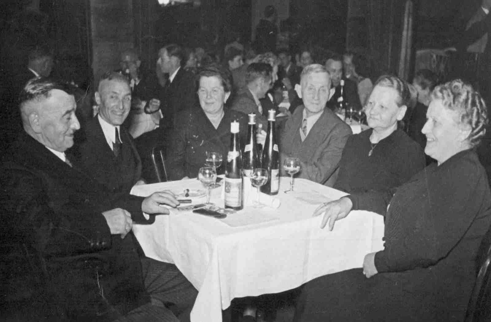
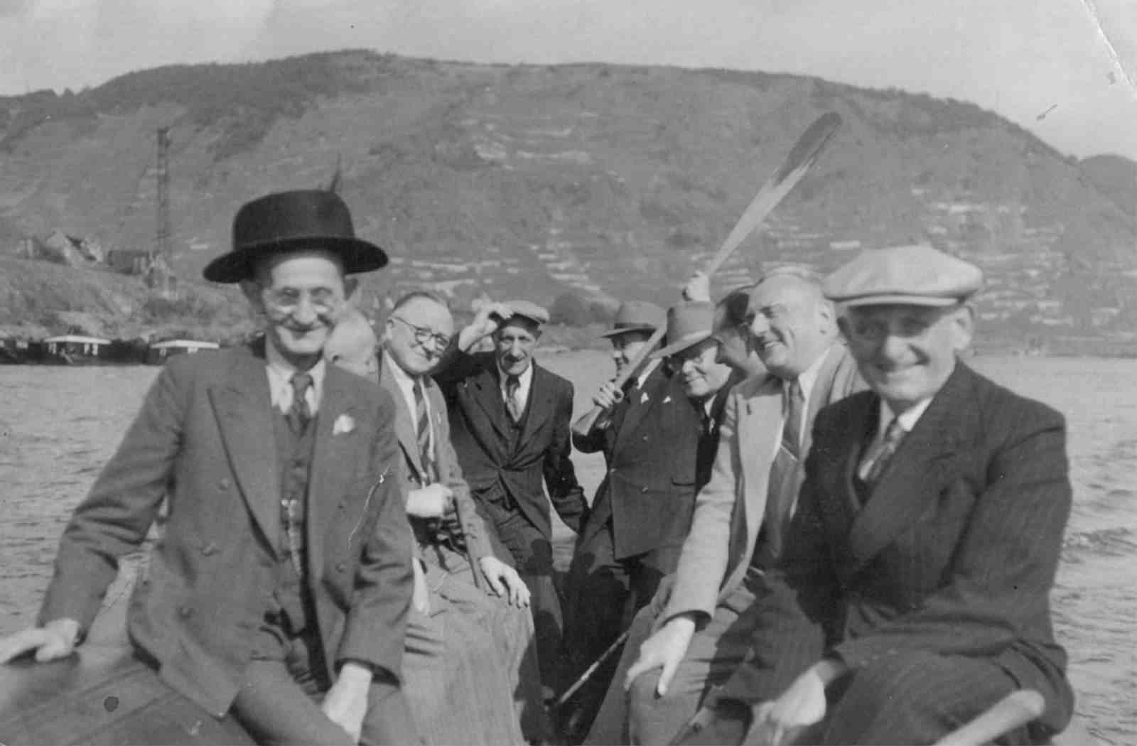
The galley Old times is using 2 images per row by using the grid class col-xs-6
. The view port is set to extra small, the number of columns to 6 per image (12 columns per row) with 2px gutter (spacing set to a value of 2).
gallery::jg_old_times[ role="mb-4 wm-800" ]
LightGallery on Videos
Lightgallery supports YouTube, Vimeo, VK and all other types of HTML5 video formats. Such as MP4, WebM, Ogg, etc.
To display YouTube, Vimeo or VK video, you can paste the video URL, or share URL, which is provided by YouTube / vimeo in the data-src attribute. The same way you display images in the gallery. Lightgallery will check the data-src attribute and if it is YouTube or vimeo video URL, it will create the video slide.
You can even provide poster image for each videos. Poster images will be loaded instead of videos. So user will be able to navigate to other slides by using mouse drag or swipe. Poster images improve performance, and maintain the flexibility of your gallery without effecting user experience. Videos will be loaded when a user clicks on the poster images. You can place poster image url in the data-poster attribute.
Lightgallery allows you to load thumbnail images automatically from YouTube, Vimeo or VK. You can specify the size of the thumbnails in the settings. Videos will be automatically paused when a user starts to navigate to another slide. So user never have to worry about it. Lightgallery takes care of everything!
Html5 Video
To display html5 video create your video content using html5 video tag inside a hidden div. Then just add id or class name of the object(hidden div) which contains your html, inside the data-html attribute. data-src should not be provided when you use html5 videos . You can even provide video html directly inside data-html attribute.
Lightgallery will automatically check your content, and if it is id or class name of your hidden div content will be fetched from the div, and will be displayed as video. Otherwise direct content will be used for displaying the videos.
Plugin dependency
Lightgallery require the video plugin to be included in your document. Include Videojs CSS and Javascript files:
<link href="http://vjs.zencdn.net/4.12.15/video-js.css" rel="stylesheet">
<script src="http://vjs.zencdn.net/4.12.15/video.js"></script>
HTML markup
<div style="display:none;" id="video_1">
<video class="lg-video-object lg-html5" controls="none" preload="none">
<source src="/path/to/video_1" type="video/mp4">
Your browser does not support HTML5 video.
</video>
</div>
...
<div style="display:none;" id="video_n">
<video class="lg-video-object lg-html5" controls="none" preload="none">
<source src="/path/to/video_n" type="video/mp4">
Your browser does not support HTML5 video.
</video>
</div>
<div class="j1-lg-galleryblock">
<div class="title">Video gallery title</div>
<ul id="j1-lg-video-html5-ul" class="row j1-lg-gutter list-unstyled">
<li class="col-xs-6 col-sm-4 col-md-3 video"
data-html="#video_1"
data-poster="/path/to/video_1-poster"
data-sub-html="Caption text for video_1" data-html="#video1">
<a class="thumbnail" href="#">
<img class="img-responsive" src="/path/tp/video-thumbnail_1.jpg">
</a>
</li>
...
<li class="col-xs-6 col-sm-4 col-md-3 video"
data-html="#video_n"
data-poster="/path/to/video_n-poster"
data-sub-html="Caption text for video_n">
<a class="thumbnail" href="#">
<img class="img-responsive" src="/path/tp/video-thumbnail_n.jpg">
</a>
</li>
</ul>
</div>
<script type="text/javascript">
$(document).ready(function(){
$('#j1-lg-video-html5-ul').lightGallery({ videojs: true });
});
</script>
Examples
At vero eos et accusam et justo duo dolores et ea rebum. Stet clita kasd gubergren, no sea takimata sanctus est Lorem ipsum dolor sit amet. Lorem ipsum dolor sit amet, consetetur sadipscing elitr, sed diam nonumy eirmod tempor invidunt ut labore et dolore magna aliquyam erat, sed diam voluptua.
Online Video
Lightgallery supports YouTube, Vimeo, VK and all other types of HTML5 video formats. Such as MP4, WebM, Ogg, etc. To display YouTube, Vimeo or VK video, you can paste the video URL, or share URL, which is provided by YouTube|vimeo in the data-src attribute. The same way you display images in the gallery.
Lightgallery will check the data-src attribute and if it is YouTube or vimeo video URL, it will create the video slide. You can even provide poster image for each videos. Poster images will be loaded instead of videos. So user will be able to navigate to other slides by using mouse drag or swipe. Poster images improve performance, and maintain the flexibility of your gallery without effecting user experience.
Videos will be loaded when a user clicks on the poster images. You can place poster image url in the data-poster attribute. Lightgallery allows you to load thumbnail images automatically from YouTube, Vimeo or VK. You can specify the size of the thumbnails in the settings.
Videos will be automatically paused when a user starts to navigate to another slide, so the users never have to worry about it.
Plugin dependency
Lightgallery require the video plugin to be included in your document.
API dependency
Lightgallery require vimeo player api to be included in your document for pausing the vimeo video.
<script src="https://f.vimeocdn.com/js/froogaloop2.min.js"></script>
HTML markup
<div class="j1-lg-galleryblock">
<div class="title">Video gallery title</div>
<ul id="j1-lg-video-online-ul" class="row j1-lg-gutter list-unstyled">
<li class="col-xs-6 col-sm-4 col-md-3 video"
data-src="/url/of/video_1"
data-poster="/path/to/video_1-poster"
data-sub-html="Caption text for video_1" data-html="#video1">
<a class="thumbnail" href="#">
<img class="img-responsive" src="/path/tp/video-thumbnail_1.jpg">
</a>
</li>
...
<li class="col-xs-6 col-sm-4 col-md-3 video"
data-src="/url/of/video_n"
data-poster="/path/to/video_n-poster"
data-sub-html="Caption text for video_n">
<a class="thumbnail" href="#">
<img class="img-responsive" src="/path/tp/video-thumbnail_n.jpg">
</a>
</li>
</ul>
</div>
<script type="text/javascript">
$(document).ready(function(){
$('#j1-lg-video-online-ul').lightGallery();
});
</script>
Example
At vero eos et accusam et justo duo dolores et ea rebum. Stet clita kasd gubergren, no sea takimata sanctus est Lorem ipsum dolor sit amet. Lorem ipsum dolor sit amet, consetetur sadipscing elitr, sed diam nonumy eirmod tempor invidunt ut labore et dolore magna aliquyam erat, sed diam voluptua.