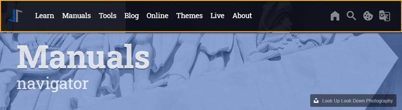
When it comes to the usability of a website the focus of your vistors is on one important component: The Navigation System of the site. The Navigation System used by J1 Theme (the Nagigator Module) is using a modified version of Bootsnav, a multi purpose navigation builder based on the Bootstrap Framework.
Bootsnav extends the native navigation features of Bootstrap by more complex functionalities and additional features. J1 Theme integrates Bootsnav into the world of Jekyll, and make all features available by configuration. No programming is needed.
|
Since J1 Theme has been moved to the most current version of Bootstrap (BS) V5 The underlying Javascript and CSS components of Bootsnav have been heavily modified. The original implementation of Bootsnav, created by Adam M Nurdin can be found here, was based on the BS Framework of version V3. The basic concepts remain unchanged but a lot of changes were made to make the library usable for J1 Theme based on Bootstrap V5. |
Bootstnav improves the Bootstrap Framework in regard to ease-of-use and a powerful, simplified navigation. This is achieved by providing a Navigation Bar (the Navigator) which features a MainMenu, an area for Quicklinks and, as collapsible components, the Topsearch element.
No doubt, content counts. A well-structured navigation system leads to an excellent browsing experience for your visitors by offering easy access, fast orientation and quick overviews.
Navigator Architecture
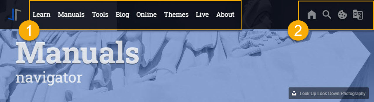
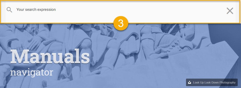
The Navigator Module is quite a complex feature of J1. The module implements three Sub-Modules: the Main Menu (1), the Quicklinks (2) and via Quicklinks (magnifying glass icon: ) an additional navigational component is available: the TopSearch (3).
Overall, the Navigator consists of the 3 fully configurable sub-modules:
-
Menu Bar
-
Quicklinks
-
TopSearch
Navigator Configuration
The configuration of the Navigator Module covers the general behaviour of the Navigation System, e.g. colors, icons etc. and the placement and behaviour of all the other navigation components.
In order to configure the Navigator Module two YAML configuration files are
used. All sub-modules of the Navigator get configured in ~/data/navigator.yml,
whereas in ~/_data/navigator_menu.yml only the _Main Menu gets configured.
As dropdown menus typically grow over the time, they might become very large
in data. This is why a separate file is used for their configuration.
~/_data for the Navigator ├──── _data
│ │
..
│ │
│ └─── modules
│ ├── ..
│ ├── navigator.yml
│ ├── navigator_menu.yml
│ └─── ..
Resource Settings
~/_data/resource.yml for the Navigator Module# ----------------------------------------------------------------------------
# Navigator, JS API to create the naviagtion for J1 Theme
# based on the (BS3) JS implementaion of Bootsnav.
#
#
- name: J1 Navigator
resource:
enabled: true
id: navigator
comment: Module Navigator
region: head
layout: [ all ]
required: always
preload: false
script_load: sync
dependencies: false
pass_init_data: false
data:
css: []
files: [ adapter/js/navigator.js ]
js: []
init_function: [ j1.adapter.navigator.init ]Navigation Bar properties
The Navigation Bar (the Navigator) is configurable in many ways. Fixation, overlay style, color settings, position and many other parameters can be adjusted to one’s personal taste.
# ------------------------------------------------------------------------------
# Navigation Bar
#
nav_bar:
  enabled:                            false
  container_id:                       navigator_nav_navbar
  translation:                        notranslate
  media_breakpoint:                   lg
  brand_position:                     right
  brand_type:                         image
  brand_type_collapsed:               text
  fixed:                              true
  style:                              overlay
  color:                              light
  position:                           left
  bottom_line_height:                 1
  bottom_line_color:                  "#EEEEEE"
  background_color_full:              rgba(0, 0, 0, 0.8)
  background_color_collapsed:         "#2196F3"
  background_color_scrolled:          "#2196F3"
# ------------------------------------------------------------------------------
# NavMenu (Mobile)
#
nav_mmenu:
  enabled:                            false
  nav_main_menu:                      navigator_nav_menu
  nav_quicklinks:                     quicklinks
  mmenu_plugin:
    node:                             "null"
    mediaQuery:                       all
    max_width:                        100000
  mmenu_navigator:
    selected:                         Selected
    slidingSubmenus:                  true
    title:                            Navigation
    theme:                            dark
  mmenu_drawer:
    position:                         right
# ------------------------------------------------------------------------------
# NavMenu (Desktop)
#
nav_menu:
  enabled:                            false
  xhr_container_id:                   navigator_nav_menu
  xhr_data_element:                   desktop_menu
  xhr_data_path:                      /assets/data/menu/index.html
  raised_level:                       5
  delay_menu_open:                    200
  max_height:                         550
  menu_font_size:                     larger
  megamenu_font_size:                 small
  icon_family:                        MDI
  icon_style:                         mdi                                     # far regular icon
  icon_color:                         "#9E9E9E"                               # md-grey
  icon_size:                          mdi-sm
  menu_item_color:                    rgba(255, 255, 255, 0.9)                # rgba-lighten
  menu_item_color_hover:              rgba(255, 255, 255, 0.5)                # rgba-lighten-900
  dropdown_style:                     raised
  dropdown_color:                     '#2196f3'
  dropdown_left:                      12                                      # px
  dropdown_item_style:                flat
  dropdown_animate:                   false
  dropdown_animate_in:                slideInDown
  dropdown_animate_out:               fadeOutDown
  dropdown_animate_duration:          .75                                     # seconds
  dropdown_item_min_width:            15                                      # rem
  dropdown_menu_max_height:           25.5                                    # rem
  dropdown_font_size:                 small
  dropdown_padding_x:                 18                                      # rem
  dropdown_padding_y:                 10                                      # px
  dropdown_item_color:                "#212121"                               # md-grey-900
  dropdown_border_color:              "#2196f3"                               # BS bg-primary
  dropdown_border_top:                0                                       # 3, px
  dropdown_border_radius:             2                                       # px
  dropdown_background_color_hover:    "#ECEFF1"                               # md-graygrey-50
  dropdown_background_color_active:   "#CFD8DC"                               # md-graygrey-100
The table below provides a list of all possible configuration parameters, their default values and descriptions.
| Parameter | Type | Default | Description |
|---|---|---|---|
|
|
string |
|
Color used for the NavBar if main menu is collapsed. |
|
|
string |
|
Color used for the NavBar if main menu is not collapsed. |
|
|
string |
|
Color used for the NavBar if the page is |
|
|
string |
|
Color used for .. bottom_line_color. |
|
|
integer |
|
bottom_line_height (px). |
|
|
string |
|
Position of the brand image one of |
|
|
string |
|
Sets the color for the top level menu items (including Quicklink icons)
ond of |
|
|
boolean |
|
Enables | Disables a fixed position of the top navigation bar. If a page is being scrolled down, the navigation bar leaves fixed at the most top position of the page. |
|
|
string |
|
Position of the menu bar on of |
|
|
string |
|
Specifies how the NavBar integrated with the page header
one of |
Main Menu properties
The Main Menu is the part of the NavBar where the website’s navigational menus themselves appear.
The following excerpt from ~/_data/navigator_menu.yml config file is an
example of how to create a main menu item. It shows a single top level item
plus a dropdown list of more topics. One of which eventually has a dropdown
list that includes another submenu.
# ------------------------------------------------------------------------------
# Menu LEARN
#
- item:                                 Learn
  sublevel:
    - title:                            Where to go
      href:                             /pages/public/learn/where_to_go/
      icon:                             foot-print
    # --------------------------------------------------------------------------
    # Roundtrip
    #
    - title:                            Roundtrip
      icon:                             briefcase-search-outline
      dropdown:
        - title:                        Present images
          href:                         /pages/public/learn/roundtrip/present_images/
          icon:                         image
        - title:                        Present videos
          href:                         /pages/public/learn/roundtrip/present_videos/
          icon:                         video
        - title:                        Typography
          href:                         /pages/public/learn/roundtrip/typography/
          icon:                         format-text
        - title:                        Icon fonts
          href:                         /pages/public/learn/roundtrip/mdi_icon_font/
          icon:                         fan
        - title:                        Asciidoc extensions
          href:                         /pages/public/learn/roundtrip/asciidoc_extensions/
          icon:                         format-annotation-plus
        - title:                        BS modal extensions
          href:                         /pages/public/learn/roundtrip/modals/
          icon:                         image
        - title:                        BS table extensions
          href:                         /pages/public/learn/roundtrip/responsive_tables/
          icon:                         table
        - title:                        BS themes
          href:                         /pages/public/learn/roundtrip/themes/
          icon:                         theme-light-dark
        - title:                        QuickSearch
          href:                         /pages/public/learn/roundtrip/quicksearch/
          icon:                         magnify
The table below shows all possible configuration parameters for the Main Menu.
Note that sublevel and dropdown are special configurational parameters
(keywords) that mark the creation of the next level of submenus.
| Parameter | Value | Default | Description |
|---|---|---|---|
|
|
string |
no default |
The top level item (base menu level) in the Main Menu. |
|
|
string |
no default |
The keyword |
|
|
string |
no default |
The keyword |
|
|
string |
no default |
The title string on an menu entry. |
|
|
string |
no default |
The icon used for an menu entry. |
|
|
string |
no default |
The (string) URL is used to reference a page to be openend from the menu. |
|
|
string |
no default |
The property |
QuickLinks properties
The QuickLink area of the Navigator hosts links to common social media websites and provides access to the TopSearch (as will be described later).
# ------------------------------------------------------------------------------
# QuickLinks settings
#
quicklinks:
  enabled:                    true
  icon_size:                  large
  icon_color:                 "#FFF"
  top_search_icon:            magnify
  sidebar_icon:               menu
  facebook_icon:              facebook
  facebook_url:               "#"
  twitter_icon:               twitter
  twitter_url:
  google_plus_icon:           google-plus
  google_plus_url:
The following table holds all the config parameters for the Quicklink area of the Navigator.
| Parameter | Type | Default | Description |
|---|---|---|---|
|
|
boolean |
|
Enables | Disables the use of the QuickLink bar. |
|
|
string |
|
Icon |
|
|
string |
no defaults |
Quick access to social media sites. The icon is placed within the
Quicklink bar in the order configured from the left to the right.
An icon is displayed, if the correspondend url is configured.
Icons available: |
|
|
string |
no defaults |
Weblink (URL) the the related web site one of:
|
TopSearch properties
The TopSearch element provides a collapsible search input on top of every page performing a Lunr full-text search. If enabled, a magnifier icon is displayed within the Quicklinks area at the most top position of the Navigator.
Below is an example of how the Top Search bar can be configured.
# ------------------------------------------------------------------------------
# QuickSearch
#
nav_quicksearch:
  enabled:                            false
  container_id:                       navigator_nav_topsearch
  type:                               quicksearch
  icon_family:                        MDI
  icon_color:                         "#FFFFFF"
  icon_size:                          mdi-2x
  search_icon:                        magnify
  close_icon:                         close
  clear_icon:                         format-clear
  input_color:                        rgba(0, 0, 0, 0.7)
  background_color:                   "#FAFAFA"
  placeholder:                        Your search expression
  search_heading_lead:                ""
  result_heading_lead:                ""
Following is a table with all the possible settings for the TopSearch element.
| Parameter | Type | Default | Description |
|---|---|---|---|
|
|
boolean |
|
Enables | Disables the use of TopSearch. |
|
|
string |
|
Background color of the Search bar. |
|
|
string |
|
Placeholder string displayed if search input is empty. |
|
|
string |
|
Icon |
|
|
string |
|
Color used for |
|
|
string |
|
Icon |
|
|
string |
|
Icon |
|
|
string |
|
Lead title for search results. |
|
|
string |
|
Subtitle (tagline) for search results (window). |