When it comes to the usability of a website, the focus of your visitors is on one important component: the Navigation System of the site. The Navigation System used by J1 Theme, the Navigator module, is a multi-purpose navigation builder based on the Bootstrap Framework.
10-60 Minutes to read
Getting started
The J1 Navigator module improves the Bootstrap Framework in regard to ease-of-use and offers a powerful, simplified navigation. This is achieved by providing a Navigation Bar that features a Main Menu, an area for Quicklinks, and — as a collapsible component — the TopSearch element.
No doubt, a well-structured navigation system leads to an excellent browsing experience for your visitors by offering easy access, fast orientation, and quick overviews.
Navigator Architecture
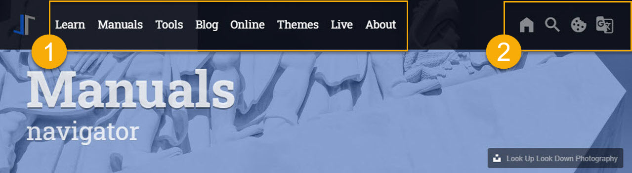
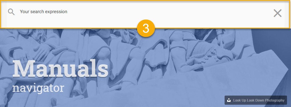
The Navigator Module is quite a complex feature of J1. The module implements three sub-modules: the Main Menu (1) and the Quicklinks (2), and via the Quicklinks (the magnifying glass icon: ) an additional navigational component is available: the TopSearch (3).
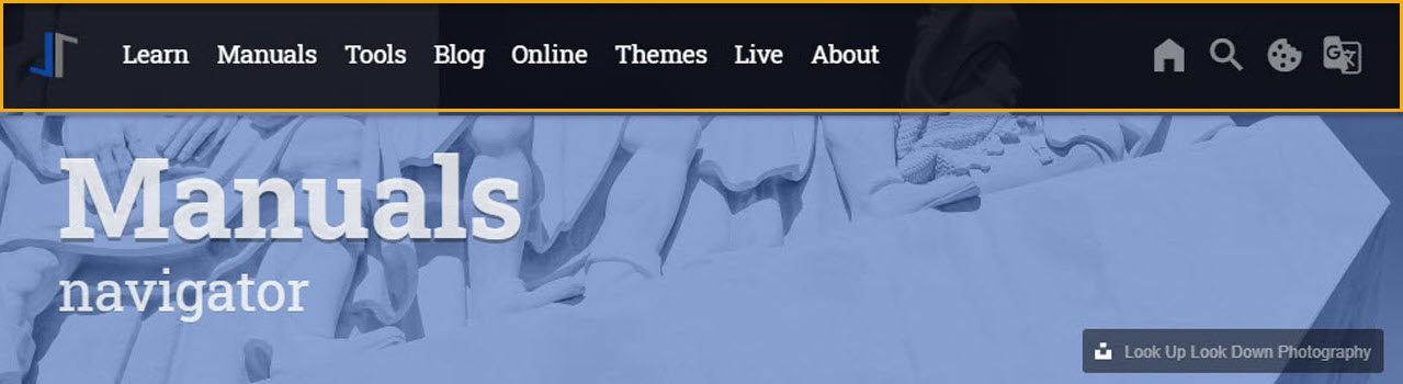
Overall, the Navigator consists of the 3 fully configurable sub-modules:
-
Menu Bar
-
Quicklinks
-
TopSearch
Navigator Configuration
The configuration of the Navigator Module covers the general behaviour of the Navigation System — for example colors and icons — and the placement and behaviour of all the other navigation components.
In order to configure the Navigator Module, two YAML configuration files are used. All sub-modules of the Navigator get configured in ~/data/modules/navigator.yml, whereas in ~/_data/modules/navigator_menu.yml only the content of the _Main Menu gets configured. As dropdown menus typically grow over time, they might become very large in data. This is why a separate file is used for their configuration.
~/_data for the Navigator ├──── _data
│ │
..
│ │
│ └─── modules
│ ├── ..
│ ├── navigator.yml
│ ├── navigator_menu.yml
│ └─── ..Resource Settings
The Navigator is loaded by J1’s resource management on every page. The resource entry below registers the module adapter and its initializer function. The Navigator is a required module of the template — you do not need to change this entry.
~/_data/resources.yml for the Navigator Module# ----------------------------------------------------------------------------
# Navigator, JS API to create the navigation for J1 Theme
# based on the JS implementation of Bootsnav.
#
- name: J1 Navigator
resource:
enabled: true
id: navigator
comment: Module Navigator
region: head
layout: [ all ]
required: always
script_load:
dependencies: false
pass_init_data: false
data:
css: []
files: [ adapter/js/navigator.js ]
js: []
init_function: [ j1.adapter.navigator.init ]Navigation Bar properties
The Navigation Bar (the Navigator) is configurable in many ways. Fixation, overlay style, color settings, position and many other parameters can be adjusted to one’s personal taste. The table below provides a list of all possible configuration parameters, their default values and descriptions.
| Parameter | Type | Default | Description |
|---|---|---|---|
| string |
| Color used for the NavBar if the main menu is not collapsed (desktop navigation). |
| string |
| Color used for the NavBar if the page is scrolled down. |
| string |
| Color used for the bottom line of the NavBar — a thin line that separates the bar from the page content. |
| integer |
| Height of the bottom line of the NavBar (px). |
| string |
| Position of the brand (logo) in the NavBar, one of |
| string |
| Type of the brand shown in the (full) NavBar, one of |
| string |
| Type of the brand shown in the collapsed NavBar (mobile navigation), one of |
| string |
| Sets the color scheme for the top level menu items (including the Quicklink icons), one of |
| boolean |
| Enables | Disables a fixed position of the top navigation bar. If a page is being scrolled down, the navigation bar remains fixed at the most top position of the page. |
| string |
| Media breakpoint at which the NavBar switches between the desktop and the mobile navigation, one of |
| string |
| Position of the menu bar, one of |
| string |
| Specifies how the NavBar is integrated with the page header, one of |
| string |
| Enables | Disables the (Google) translation of the menu texts, one of |
Main Menu properties
The Main Menu is the part of the NavBar where the website’s navigational menus themselves appear. The following excerpt from ~/_data/navigator_menu.yml config file is an example of how to create a main menu item. It shows a single top level item plus a dropdown list of more topics. One of which eventually has a dropdown list that includes another submenu.
The table below shows all possible configuration parameters for the Main Menu. Note that sublevel and dropdown are special configurational parameters (keywords) that mark the creation of the next level of submenus.
| Parameter | Value | Default | Description |
|---|---|---|---|
| string | no default | The top level item (base menu level) in the Main Menu. |
| keyword | no default | The keyword |
| keyword | no default | The keyword |
| string | no default | The title string of a menu entry. |
| string | no default | The icon used for a menu entry. The icon is given by its (MDI) icon name — no family name prefix is needed. |
| string | no default | The (string) URL is used to reference a page to be opened from the menu. |
| string | no default | The property |
QuickLinks properties
The QuickLink area of the Navigator hosts links to common social media websites and provides access to the TopSearch (as will be described later). The following table holds all the config parameters for the Quicklink area of the Navigator.
| Parameter | Type | Default | Description |
|---|---|---|---|
| boolean |
| Enables | Disables the use of the Quicklinks bar. |
| string |
| Icon font used for all icons of the Quicklinks bar. |
| string |
| Color used for the icons of the Quicklinks bar. |
| string |
| Color used for the icons of the Quicklinks bar on mouse hover. |
| string |
| Size used for the icons of the Quicklinks bar. |
| string | see defaults file | Icon of a link or action button — for example |
| string |
| Weblink (URL) of a link button — for example |
| string | see defaults file | Action of an action button — for example |
| string | see defaults file | Label (tooltip) of a button — for example |
TopSearch properties
The TopSearch element provides a collapsible search input on top of every page performing a Lunr full-text search. If enabled, a magnifier icon is displayed within the Quicklinks area at the most top position of the Navigator. Following is a table with all the possible settings for the TopSearch element.
The TopSearch is enabled with the Navigator; the search itself — the search engine, the search dialog, and all of its texts — is provided and configured by the J1 site search module (based on Lunr). The magnifier icon in the Quicklinks bar is only displayed if the site search module is enabled.
| Parameter | Type | Default | Description |
|---|---|---|---|
| boolean |
| Enables | Disables the use of the TopSearch. If enabled (and the site search module is active), a magnifier icon is displayed in the Quicklinks bar that opens the search dialog on top of the current page. |
J1 Integration
The Navigator is fully integrated in the J1 Template and is a required module of the theme — every page of a J1 site uses the Navigator to build the navigation bar at the top of the page. The template loads the module on every page, generates the HTML portions of the Main Menu and the Quicklinks from your YAML configuration at build time, and connects all menus, dropdowns, and quicklink buttons at runtime.
The content of the Main Menu is fully under your control: all menu items, submenus, and dropdowns are defined by simple YAML data — no HTML or JavaScript coding is needed. All other settings are optional and come with useful default values.
Module sources
The sources for the Navigator are stored within the asset path of the J1 Template. You’ll find the core module under /assets/theme/j1/modules/navigator:
  ├───assets
  │   ├───data
  │   │   ├───menu
  │   │   │       menu.html
  │   │   └───quicklinks
  │   │           quicklinks.html
  │   └───theme
  │       └───j1
  │           ├───adapter
  │           │   └───js
  │           │           navigator.js
  │           └───modules
  │               └───navigator
  │                   └───js
  │                           navigator.js
  └───_data
      └───modules
          │   navigator.yml
          │   navigator_menu.yml
          └───defaults
                  navigator.yml
The parts of the module have the following jobs:
navigator.js(module)-
The core of the module — a JavaScript API based on the (jQuery) plugin Bootsnav. The core builds the desktop dropdown menus, switches between the desktop and the mobile navigation at a configurable breakpoint, manages sticky and transparent navigation bars on scroll, and connects the action buttons of the Quicklinks with the matching J1 modules.
navigator.js(adapter)-
The J1 adapter for the Navigator. It reads the YAML settings, loads the generated HTML portions of the Main Menu and the Quicklinks into the page (via AJAX), initializes the core module, and applies all configured colors and styles to the navigation bar.
menu.html-
The HTML data file of the Main Menu (desktop). The file is generated at build time from your menu configuration
navigator_menu.ymland is loaded dynamically into the navigation bar by the adapter. quicklinks.html-
The HTML data file of the Quicklinks bar. The file is generated at build time from the
nav_quicklinkssettings and is loaded dynamically into the navigation bar by the adapter. A quicklink icon is only generated if the related module (for example the site search or the theme toggler) is enabled. navigator.yml(two files)-
The YAML configuration of the module. The file under
_data/modules/defaultscontains the default settings, the file under_data/modulescontains your user settings. All sub-modules except the Main Menu are configured here. navigator_menu.yml-
The YAML configuration of the Main Menu. All menu items, submenus, and dropdowns of the desktop and the mobile navigation are defined in this file.
| The core module and the adapter use the same filename |
Configuration
The Navigator is configured by three YAML files. The default settings live in _data/modules/defaults/navigator.yml — this file documents all available options and should not be changed. Your personal user settings live in _data/modules/navigator.yml. At build time, both files are merged: every option you set in the user file overwrites the default value. The third file, _data/modules/navigator_menu.yml, contains the content of the Main Menu.
By default, the Navigator and all of its sub-modules are disabled in the defaults file. To activate the module, set the option enabled to true for the module itself and for every sub-module you want to use in your user configuration:
settings:
  enabled: true
  nav_bar:
    enabled: true
  nav_menu:
    enabled: true
  nav_quicklinks:
    enabled: true
  nav_topsearch:
    enabled: true
  nav_mmenu:
    enabled: true
Initialization
The Navigator is initialized automatically on every page load by the J1 adapter — you do not need to add any code to your pages. The adapter runs the following steps:
-
Read the merged YAML configuration (defaults plus user settings) of all sub-modules.
-
Load the generated HTML portions of the Quicklinks and the Main Menu (the data files
quicklinks.htmlandmenu.html) into the navigation bar via AJAX. -
Wait until all HTML portions are loaded, then initialize the Navigator core. The core builds the dropdown menus, decides between the desktop and the mobile navigation based on the configured media breakpoint, and connects all quicklink action buttons with their modules.
-
Apply the configured colors and styles (for example the background colors of the navigation bar) as CSS to the page.
-
Register a resize handler: if the size of the browser window changes, the Navigator switches between the desktop and the mobile navigation automatically.
Default settings
The general (default) settings of the Navigator define the icon font used by all navigation components and the primary color of the navigation system. The icons of the J1 Template are taken from the Material Design Icons (MDI) font; colors are given as CSS variables of the Material Design color palette.
# ------------------------------------------------------------------------------
# Default settings
#
enabled:                              true
icon_family:                          mdib
icon_style:                           mdib
icon_color:                           mdib-grey
icon_size:                            mdib-sm
nav_primary_color:                    var(--md-blue)
MainMenu settings
The content of the Main Menu is defined in the configuration file _data/modules/navigator_menu.yml as a simple YAML list. A menu is built of top level items (keyword item); each top level item opens a dropdown list of menu entries (keyword sublevel). A menu entry either links to a page (property href) or opens a nested dropdown menu of a third or fourth menu level (keyword dropdown).
The following excerpt shows a single top level item Learn with a dropdown list of entries. One of the entries (Tutorials) opens a nested dropdown that includes another submenu:
# ------------------------------------------------------------------------------
# Menu LEARN
#
- item:                                 Learn
  sublevel:
    - title:                            Where to go
      href:                             /pages/public/learn/where_to_go/
      icon:                             foot-print
    # --------------------------------------------------------------------------
    # Tutorials
    #
    - title:                            Tutorials
      icon:                             wizard-hat
      dropdown:
        - title:                        Rocketstart
          href:                         /pages/public/learn/rocketstart/
          icon:                         rocket-launch
        - title:                        Jekyll In A Day
          icon:                         alpha-j-box
          dropdown:
            - title:                    Meet & Greet
              href:                     /pages/public/learn/kickstart/web_in_a_day/meet_and_greet/
              icon:                     human-queue
            - title:                    Development System
              href:                     /pages/public/learn/kickstart/web_in_a_day/dev_system/
              icon:                     hammer-wrench
            - title:                    Creating content
              href:                     /pages/public/learn/kickstart/web_in_a_day/create_content/
              icon:                     file-document-edit
NavigationBar settings
The Navigation Bar is the frame of the whole navigation system: the bar at the top of every page that hosts the brand (logo), the Main Menu, and the Quicklinks. The settings of the nav_bar section define the general look and feel of the bar: the position of the brand and the menu, the media breakpoint at which the bar switches to the mobile navigation, and the colors of the bar in its different states (full, collapsed, and scrolled).
The nav_menu section configures the desktop version of the Main Menu — mainly the dropdown menus: their style, colors, animation, and the delay used to open a dropdown on hover. The nav_mmenu section configures the mobile version of the Main Menu (the drawer menus), which is managed by the separate MMenu module.
# ------------------------------------------------------------------------------
# NavBar
#
nav_bar:
  enabled:                            false
  translation:                        notranslate
  container_id:                       navigator_nav_navbar
  media_breakpoint:                   lg
  brand_position:                     right
  brand_type:                         image
  brand_type_collapsed:               text
  fixed:                              true
  style:                              overlay
  color:                              light
  position:                           left
  bottom_line_height:                 1
  bottom_line_color:                  var(--md-gray-300)
  background_color_full:              rgba(255, 255, 255, 0.8)
  background_color_scrolled:          var(--md-blue)
# ------------------------------------------------------------------------------
# NavMenu (Mobile)
#
nav_mmenu:
  enabled:                            false
  nav_main_menu:                      navigator_nav_menu
  nav_quicklinks:                     quicklinks
  mmenu_plugin:
    node:                             "null"
    mediaQuery:                       all
    max_width:                        100000
  mmenu_navigator:
    selected:                         Selected
    slidingSubmenus:                  true
    title:                            Navigation
    theme:                            dark
  mmenu_drawer:
    position:                         right
# ------------------------------------------------------------------------------
# NavMenu (Desktop)
#
nav_menu:
  enabled:                            false
  xhr_container_id:                   navigator_nav_menu
  xhr_data_element:                   desktop_menu
  xhr_data_path:                      /assets/data/menu/index.html
  raised_level:                       5
  delay_menu_open:                    200                                     # milli seconds
  max_height:                         600                                     # px
  menu_font_size:                     larger
  megamenu_font_size:                 small
  icon_family:                        mdib
  icon_style:                         mdib
  icon_color:                         var(--md-gray-500)
  icon_size:                          mdib-sm
  menu_item_color:                    var(--md-gray-900)
  menu_item_color_hover:              var(--md-gray-300)
  dropdown_style:                     raised
  dropdown_color:                     var(--md-blue)
  dropdown_left:                      12                                      # px
  dropdown_item_style:                flat
  dropdown_animate:                   false
  dropdown_animate_in:                slideInDown
  dropdown_animate_out:               fadeOutDown
  dropdown_animate_duration:          .75                                     # seconds
  dropdown_item_min_width:            15                                      # rem
  dropdown_menu_max_height:           35                                      # rem
  dropdown_font_size:                 small
  dropdown_padding_x:                 18                                      # rem
  dropdown_padding_y:                 10                                      # px
  dropdown_item_color:                var(--md-gray-900)
  dropdown_border_color:              var(--md-blue)
  dropdown_border_top:                0                                       # px
  dropdown_border_radius:             2                                       # px
  dropdown_background_color_hover:    var(--md-gray-300)
  dropdown_background_color_active:   var(--md-gray-500)
Quicklink settings
The Quicklinks bar hosts two types of buttons. Link buttons open external websites — for example your GitHub project or a social media site. A link button is configured by an icon, a URL, and a label; the button is only displayed if a URL is configured (the value none disables a button). Action buttons open a dialog of another J1 module — for example the site search, the Cookie Consent dialog, or the Theme Toggler. An action button is displayed automatically if the related module is enabled.
# ------------------------------------------------------------------------------
# NavQuicklinks
#
nav_quicklinks:
  enabled:                            false
  xhr_container_id:                   navigator_nav_quicklinks
  xhr_data_element:                   quicklinks
  xhr_data_path:                      /assets/data/quicklinks/index.html
  icon_family:                        mdib
  icon_color:                         var(--md-gray-900)
  icon_color_hover:                   var(--md-gray-500)
  icon_size:                          mdib-2x
  # Link buttons
  # --------------------------------------------------------------------------
  home_icon:                          home-variant
  home_url:                           /                                       # URL|none
  home_label:                         Home
  github_icon:                        github-circle
  github_url:                         none
  github_label:                       Github
  # Action buttons
  # --------------------------------------------------------------------------
  site_search_icon:                   magnify
  site_search_action:                 site_search
  site_search_label:                  Fulltext Search
  cookies_icon:                       cookie
  cookies_action:                     cookie-consent
  cookies_label:                      Cookie Consent
  theme_toggler_icon:                 lightbulb-outline
  theme_toggler_action:               themeToggler
  theme_toggler_label:                Theme Toggler
TopSearch settings
The TopSearch element offers a full-text search over all pages of your site. The search itself is powered by the J1 site search (based on the search engine Lunr); the Navigator provides the access to the search: if the site search is enabled, a magnifier icon () is displayed in the Quicklinks bar that opens the search dialog on top of the current page.
In the Navigator configuration, the TopSearch only needs to be enabled. All settings of the search itself — for example the placeholder text of the input field or the headings of the result window — are configured with the site search module:
# ------------------------------------------------------------------------------
# NavTopsearch
#
nav_topsearch:
  enabled:                            true
Programming Interface
The Navigator core is implemented as a J1 API module registered as j1.api.navigator. The implementation is based on the (jQuery) plugin Bootsnav, a multi-purpose navigation builder for the Bootstrap Framework. In the J1 Template, you normally do not call the core module yourself — the J1 adapter (j1.adapter.navigator) does all the work for you: it loads the generated HTML portions of the menus, passes the merged YAML configuration to the core, and initializes the module on every page load. The sections below describe the core interface for users who want to understand the integration in detail.
The core module offers the following features:
- Responsive navigation
-
The Navigator switches automatically between the desktop navigation (the Main Menu with dropdowns) and the mobile navigation (the drawer menus of the MMenu module) at a configurable media breakpoint. The navigation is re-evaluated whenever the size of the browser window changes.
- Multi-level dropdown menus
-
Dropdown menus of the desktop navigation open on hover with a configurable delay — this prevents menus from flickering open while the mouse only passes by. Nested dropdowns of a third and fourth menu level are supported; very long dropdowns are made scrollable automatically.
- Sticky and transparent navigation bars
-
The navigation bar can stay fixed at the top of the page while scrolling. A transparent bar (style
overlay) changes its background color as soon as the page is scrolled down, so the menu stays readable on any content. - Quicklink actions
-
The core connects the action buttons of the Quicklinks bar with their J1 modules: the site search dialog, the Cookie Consent dialog, the Translator dialog, and the Speak2Me dialog are opened by a simple click on the matching icon.
- In-page smooth scrolling
-
Click events on badge elements (for example the tag badges of blog posts) are bound to a smooth scroll animation that moves the page to the linked section instead of jumping there.
Initialization
In the J1 Template, all JavaScript files of the Navigator are loaded by the resource management of the template — no manual script tags are needed. The adapter function j1.adapter.navigator.init is registered as the initializer in the resource configuration (see section Resource Settings) and runs automatically on every page load.
The adapter loads the HTML portions of the Quicklinks and the Main Menu first. As soon as all portions are available in the page, the adapter initializes the core module by passing the merged YAML configuration:
// Initialize the Navigator core (called by the adapter)
j1.api.navigator.init(navDefaults, navMenuOptions);
The parameters have the following meaning:
navDefaults-
The complete (merged) configuration of the Navigator — all sub-module sections of the configuration files, defaults overloaded by the user settings.
navMenuOptions-
The (merged) configuration of the desktop Main Menu — the
nav_menusection of the configuration files.
Methods
All methods of the core module are called on the API object j1.api.navigator. The methods are used by the J1 adapter — for your own code, they are useful if the layout of a page is changed dynamically and the navigation needs to be re-evaluated.
init
Initializes the Navigator core. The method creates a wrapper element for the navigation system, builds the dropdown menus for the current window size (method manageDropdownMenu), activates sticky navigation bars (method navbarSticky), and registers all event handlers of the navigation (method eventHandler). When finished, the core reports the state core_initialized to the adapter.
j1.api.navigator.init(navDefaults, navMenuOptions);eventHandler
Registers all event handlers of the navigation system: the click handlers of the quicklink action buttons (site search, Cookie Consent, Translator, and Speak2Me), the smooth scroll handlers for badge elements, and the scroll handlers that change the background of transparent and sticky navigation bars. The method is called once by init — calling it a second time would register all handlers twice.
j1.api.navigator.eventHandler(navDefaults);manageDropdownMenu
Builds the menus of the navigation bar for the current window size. Based on the configured media breakpoint (option nav_bar.media_breakpoint, one of sm|md|lg), the method decides between the two navigation modes:
- Mobile
-
If the window is smaller than the breakpoint, the desktop menu is collapsed and the Quicklinks bar is shown. The mobile menu itself (the drawers) is managed by the separate MMenu module.
- Desktop
-
If the window is larger than the breakpoint, the desktop menu is shown and all dropdown menus are activated: the dropdowns open on hover, delayed by the configured time (option
nav_menu.delay_menu_open), and very long dropdown lists are made scrollable.
The J1 adapter calls this method on every resize of the browser window to switch between the two modes:
j1.api.navigator.manageDropdownMenu(navDefaults, navMenuOptions);navbarSticky
Activates the sticky mode of the navigation bar. If the bar is configured fixed, the method measures the height of the bar, reserves the needed space in the page, and registers a scroll handler that keeps the bar at the most top position of the window while the page is scrolled down.
j1.api.navigator.navbarSticky();updateSidebar
Updates the user data displayed in the sidebar drawer (see the boxes of type site_info and user_info in the nav_mmenu configuration). The method resolves all macro placeholders (the values starting with ??, for example ??theme-name) to their current values.
j1.api.navigator.updateSidebar(user_data);Messages
The Navigator uses the J1 message system for the communication between the core module and the adapter. When the core initialization is finished, the core sends a state message to the adapter:
message.type    = 'state';
message.action  = 'core_initialized';
message.text    = 'navigator core initialized';
j1.sendMessage('j1.navigator.core', 'j1.adapter.navigator', message);
The adapter waits for this message before it applies the configured colors and styles and finishes the module initialization.
Callbacks
No public callbacks or events available.
| The Navigator registers a number of internal event handlers (for example on window resize and page scroll) to keep the navigation in sync with the browser window. These handlers are used by the module only and are not a public callback interface. |
Examples
Re-evaluate the navigation after a dynamic layout change (for example if the size of the content area was changed by your own code):
// Rebuild the menus for the current window size
j1.api.navigator.manageDropdownMenu(
  j1.adapter.navigator.navDefaults,
  j1.adapter.navigator.navMenuOptions
);
// Re-activate sticky navigation bars
j1.api.navigator.navbarSticky();