SwiperJS is a Javascript API that creates modern slider shows. All sliders use hardware-accelerated features like 3D transitions to perform best on modern devices. SwiperJS-based sliders are intended to be displayed at their best on all types of websites, such as those viewed on desktop computers, tablets, or smartphones.
What SwiperJS Apps are
SwiperJS Apps are preconfigured swipers (sliders) that use the SwiperJS API as a base and combine it with other libraries like AmplitudeJS, VideoJS, and Photoswipe to create powerful and modern slide shows to be embedded in webpages of a J1 Template based site.
|
SwiperJS Apps create sliders that display text, images, videos, or audio files. They can be used to create simple sliders or more complex slide shows with different type of content. SwiperJS Apps are defined by pure configuration and do not require any programming. |
SwiperJS Apps for Text
Swipers are mnainly used for displaying images. Still, the implementation for the J1 Template supports a lot more sources to be displayed as a slide. Simple text for example.
Base Text Swiper
Important statements or topics can be placed on top of an article or a paragraph to give them better visibility. You can present facts to know animated for the readers attention.
Extended Text Swiper
A more emphasized type of a text-based swiper is a parallax text swiper. If you want to focus the meaning, this kind of a swiper may be nteresting. Parallax text sliders can be placed as banners on a page.
SwiperJS Apps for Images
Swipers (sliders or carousels) are mainly used for pictures animated as a managed group. Find below some examples of using simple (base) swipers for presenting images using the Swiper App.
Base Image Swipers
Debitis quisquam doloremque qui architecto facere asperiores. Id ut sint eum sit esse officiis vel asperiores nesciunt. Porro at ut dolor tenetur amet consequatur asperiores voluptatem. Voluptas distinctio quaerat non. Cumque aliquam vero voluptatibus enim quidem ut soluta sequi tenetur.
Image Full-width
Find an example of a full-width slider with pagination control enabled to browse all images back and forth. Additionally, the pagination bullets below the Swiper App indicate how many slides (images) the slide show contains for improved usage experience.
Equal Image Sizes
Important statements or topics can be placed on top of an article or a paragraph to give them better visibility. In one line, you can present many facts to know animated for the reader’s attention within a single line.
Mixed Image Sizes
Pictures you’ve made are typically not even in size. Images may have the same size (resolution), but some are orientated landscape, or others may be portrait. For that reason, a more powerful swiper is needed to create so-called justified slides.
Extendend Image Swipers
Layouts in terms of J1 Template for SwiperJS are transformations of a Swiper. A layout is used to rebuild it for a more complex visual presentation for the Swiper’s slides. The Layout of a swiper can improve the useability or make the presentation of a slideshow more interesting.
Layout Thumb Top|Bottom
To give the users a more visual control over a slideshow, Swiper sliders can provide UI elements by placing minified images or text elements (thumbs) side-by-side (on the left|right), or at the bottom|top of a swiper. Find below examples how to control such sliders' by a thumb (slave) silder.
|
This Layout creates best results for high-quality images for websites mainly used on desktop computers. |
This Thumb Slider uses minified images that are placed to control the (main) slider at the top or the bottom. This swiper type creates a thumbed Swiper that uses two lanes, which takes up a lot of space but can render the sliders' images optimally.
Layout Thumb Right|Left
A more mobile-friendly version of a Thunb slider is created by placing the minified images for the slider side-by-side on the right or the left. This swiper use just a single lane in the page, but minifies the presented images as required for the lane heigth specified.
|
Adding a Lightbox to a single-lane swiper allows users to enlarge the presented images. |
-
 Husky
Husky -
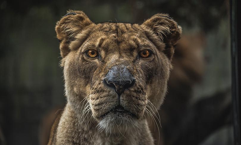 Female Lion
 -
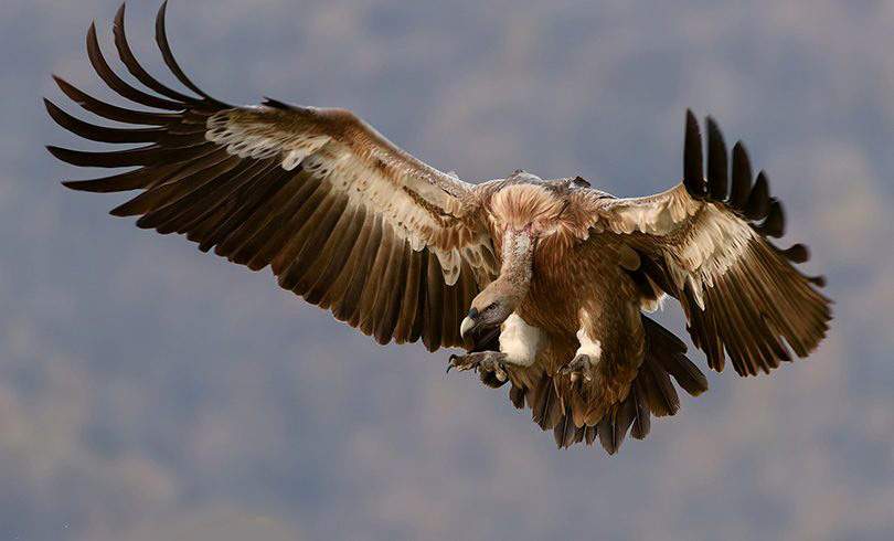 Approaching Vulture
 -
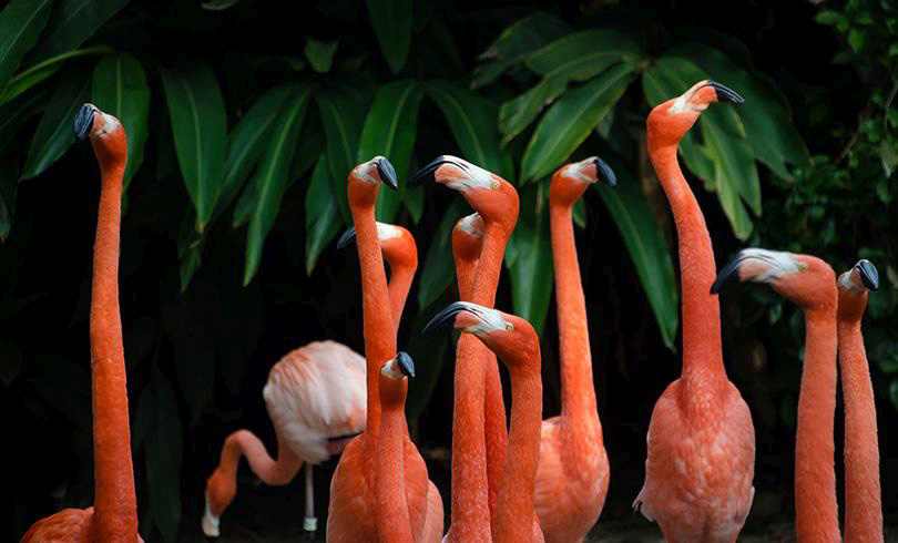 Group of Flamingos
 -
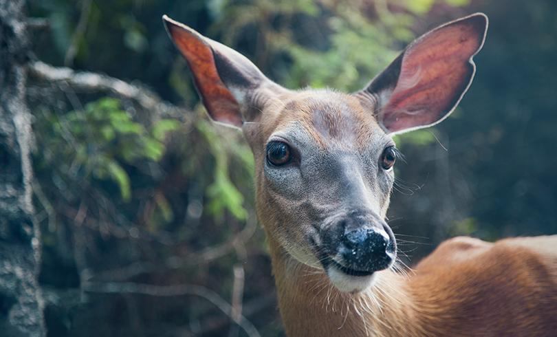 Young Deer
 -
 Little Bird
-
Husky
-
Female Lion
-
Approaching Vulture
-
Group of Flamingos
-
Young Deer
-
Little Bird
Layout Neighbor
A slideshow typically presents a larger number of slides, which requires a sort of navigation. The effect neighbors accompanies the active slide by their neighbors on the left and right as previews. The neighbor on the left acts like a previous button and scrolls the slides backward. The neighbor on the right acts like a next button and scrolls the slides forward.
|
The effect transforms a slider into a quite compact presentation that does not require any (additional) navigation elements. |
Layout Panorama
The layout panaorama presents available slides of a slider as a group. The group is displayed in a virtual, circular viewing angle.
|
The effect is great for slides connected in terms of content to give the user a panoramic view impression. |